Finally Getting Around to Hanging Some Art

70A2FED7-15D4-4D99-BBBE-DD522D95F078.JPG

We hosted Thanksgiving at our house this year (for the first time ever!) and had a bunch of family and friends over for the day. Since we knew we were hosting, we wanted to make sure everything looked good and ready for guests. We've had art lying around the house since we moved in in April just begging to be framed and hung on the wall, but for some reason we kept putting it off and finding literally any other project to work on besides that.

We've been collecting art over the last couple of years and there was no better excuse to hang it than with the holidays just around the corner. Thats when Framebridge came to the rescue! We went to their website, picked out our favorite frames from their huge and beautiful collection, input the dimensions of our art, and waited to receive packaging to send in our art. Once the packages arrived (with the return shipping label!), we put the art in them, sealed them up, and sent them off to be framed. Literally 4 days later we had our old art back home with us, only this time in brand new custom frames that the people at Framebridge made and sent back to us with the utmost care. It's as simple as that.

Then the fun began! We FINALLY had our art framed! It was time to hang it all around the house. Take a look:

4B919046-0E9D-4B4F-9225-BB2DDE7F3634.JPG
A09A828E-E4B5-448E-849F-BDA41459C4C4.JPG

Our trip to Seattle last summer made such an impression on us, we had to frame this old picture of Puget Sound we picked up while we were there. We framed it in Framebridge's steel-ribbed frame and it's our absolute favorite one! That's the thing about Framebridge, they offer so many different styles that you can get whatever type of frame fits your design aesthetic. 

In our dining room we hung a picture of the old train depot here in Cleveland that we picked up at an estate sale TWO YEARS AGO. We weren't kidding about pictures lying around the house for way too long.

E1CAE108-B9B9-45B6-8169-C91E71980E31.JPG
FAC5249B-916D-4208-9224-6B899EEBD320.JPG

We had two prints framed that we purchased on our most recent trip to Rosemary Beach this past summer and hung them in our upstairs guest bath. The bamboo frames are so different and unique. Obsessed with them:

DDC48451-1120-46A0-AEE7-32C5AD30DBE4.JPG
46E7A57D-2D36-4018-BF56-2F21D26517E3.JPG

In our breakfast nook we had an eye chart that we picked up at a local antique store framed, along with the original blueprints of our last home below it. 

70A2FED7-15D4-4D99-BBBE-DD522D95F078.JPG

The last picture we had framed was a map of way the stars were aligned on the day we got married from The Night Sky. Seriously y'all, these pictures make such thoughtful, completely original gifts for loved ones. We highly recommend checking them out. We ended up placing it in one of our guest bedrooms (we call it the tree house room because of its vaulted ceilings and big trees right outside the windows) and it looks great against the white walls and striped duvet cover.

D9213D14-A248-4D1E-8F13-FF917D0B688C.JPG

So here's to Framebridge & The Night Sky for making our house feel more like a home, especially during the holiday season. We hope you all had a wonderful Thanksgiving spent with family, friends, and some delicious food.

The Most Stylish Restaurants in New York City

stylish-new-york-restaurants-12.jpg

We came across an old article on Architectural Digest the other day and it stopped us in our tracks. We are suckers for all things NYC and of course food, so we ate this article right up. Written by Stefanie Waldek, it gives the mind-blowing fact that there are "over 24,000 eating establishments to choose from in New York City," so you could "eat at a different restaurant for breakfast, lunch, and dinner each day for 8,000 daysโ€”or 22 yearsโ€” straight." Um, okay. *books trip to NYC immediately*

The restaurants are absolutely breathtaking, but the one that caught our eye the most was Eleven Madison Park, above. We're obsessed with the way the colors blend together to create such a sophisticated atmosphere (the whites! the blacks! the browns! the creams!). Even the name gives off an air of prestige.

Below are some of our favorites they mention:

Polo Bar

Polo Bar

Four Seasons Restaurant

Four Seasons Restaurant

L'Amico

L'Amico

Cherche Midi

Cherche Midi

Head on over to AD to check out the full article and the other restaurants they feature. We'll have one of each, pleaseandthankyou.

(all photos via here)

Pottery Barn Sale This Weekend

You guys know our feelings about Pottery Barn, so it's no surprise we freaked out when we saw they were offering 20% off your entire order from now until Oct. 9th! Click here to shop their website and use promo code friends to receive the discount.

Here are some itmes that have caught our eyes this fall (click on the picture to shop the piece):

Pillows

Accessories

Lamps

ย 

ย 

Our Fall Front Porch Featuring Pottery Barn

DSC_0561.jpg

After tackling a fall tablescape last week, we're back with part 2 of our Pottery Barn Fall Collaboration and this time we're focusing our attention on the front door. 

The front door is one of the most important parts of your home because it's the first thing people see when they come over. As they say, first impressions are everything, and that couldn't be more true in this case. We believe your front door should say "Welcome! Come in and stay a while, we're glad you're here." With the holidays coming up, it's even more important to turn your focus to this part of your home, and now that it's officially October, it's the perfect time to begin decorating.

The first step is to add your biggest items first, and branch out from there. In this case, we started with the urns and branches and put them on either side of the door. We're all about symmetry over here, especially when trying to highlight a focal point (the door). Visually, it's a lot more appealing and you can honestly never go wrong with two pots/vases/urns flanking your front door. We then added some faux leaf garland around the door which really ties the whole thing together.

DSC_0575.jpg

Next we brought it the mums, which are an absolute fall must-have for any front porch. We chose them in orange but we also think yellow or maroon would look amazing too. We then began bringing in the pumpkins which is always so much fun because there are so many different ways you can go with this. Pumpkins come in a lot of different shapes and sizes so this is the part where you can really play around and go crazy.

DSC_0603.jpg

The faux pumpkins are so beautiful that it's really hard to tell they're not real, even right next to the actual real ones. We also used a few pretty ceramic ones to really get a good mix in there and switch it up a bit. We love how it's kind of a smorgasbord of pumpkins all clustered together to make up one big, colorful entryway #diversity.

One important thing to take into consideration is the height of your objects that you're styling with. It's always best to put your larger items in the back and place your smaller items in the front. This will give you a nice layered, intentional look.

DSC_0586.jpg

We added lanterns with faux candles (that actually flicker) in them for a sophisticated, classic look that not only looks great against the fun colors of the pumpkins, but also provide really nice ambiance at night. This is when it all started to come together.

DSC_0597.jpg

The faux beaded spiders are such a fun touch because they're so real looking and will definitely have guests looking twice to make sure they're not. We had them "climbing" up the branches for a spooky, Halloween feel that you can take off once it gets closer to Thanksgiving.

DSC_0594.jpg

The final touch, for which no fall front door would be complete without, is the wreath. Pottery Barn's harvest pumpkin wreath goes perfectly with the garland around the door and truly completes the fall look. Nothing says "come on in" more than a festive wreath greeting folks walking up to your front door. It's really the icing on the pumpkin spice cake that completes your fall look.

DSC_0591.jpg
DSC_0584 (1).jpg
DSC_0567 (1).jpg
DSC_0554 (1).jpg

That concludes part 2 of our fall decorating series with Pottery Barn. Stay tuned for part 3 where we will be decorating our fireplace mantle using these same items. Have we mentioned how much we love fall?

-Full list of products used-

ย 

A Fall Tablescape Featuring Pottery Barn

DSC_0559.jpg

If you've been following us for a while, you know that our favorite season is fall. We love absolutely everything about it: the weather, the food, the clothes, and the overall cozy feeling the season brings. But by far the best thing about fall to us is getting to decorate our house. More specifically, making it feel like an inviting and welcoming home during our favorite time of the year.

We collaborated with Pottery Barn for a three part series to bring you ideas on how to spruce up your fall decor this year, but with a fun little twist. We will be showing you how to decorate three different parts of your home using seven key items so that your money, and your creativity, will go a long way. The three areas we will be focusing on will be the dining room, the front door, and the fireplace mantle. Part 1 of the series is the dining room, so letโ€™s get right to it!

4ED48F02-423C-4127-889D-2324AC9EBF27.JPG

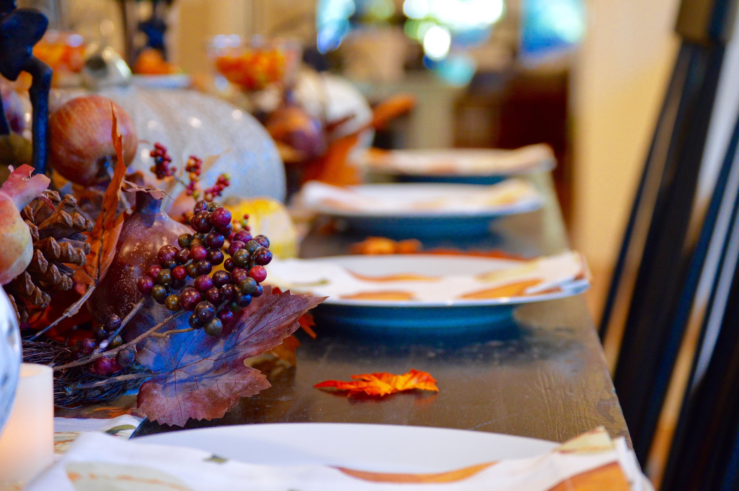
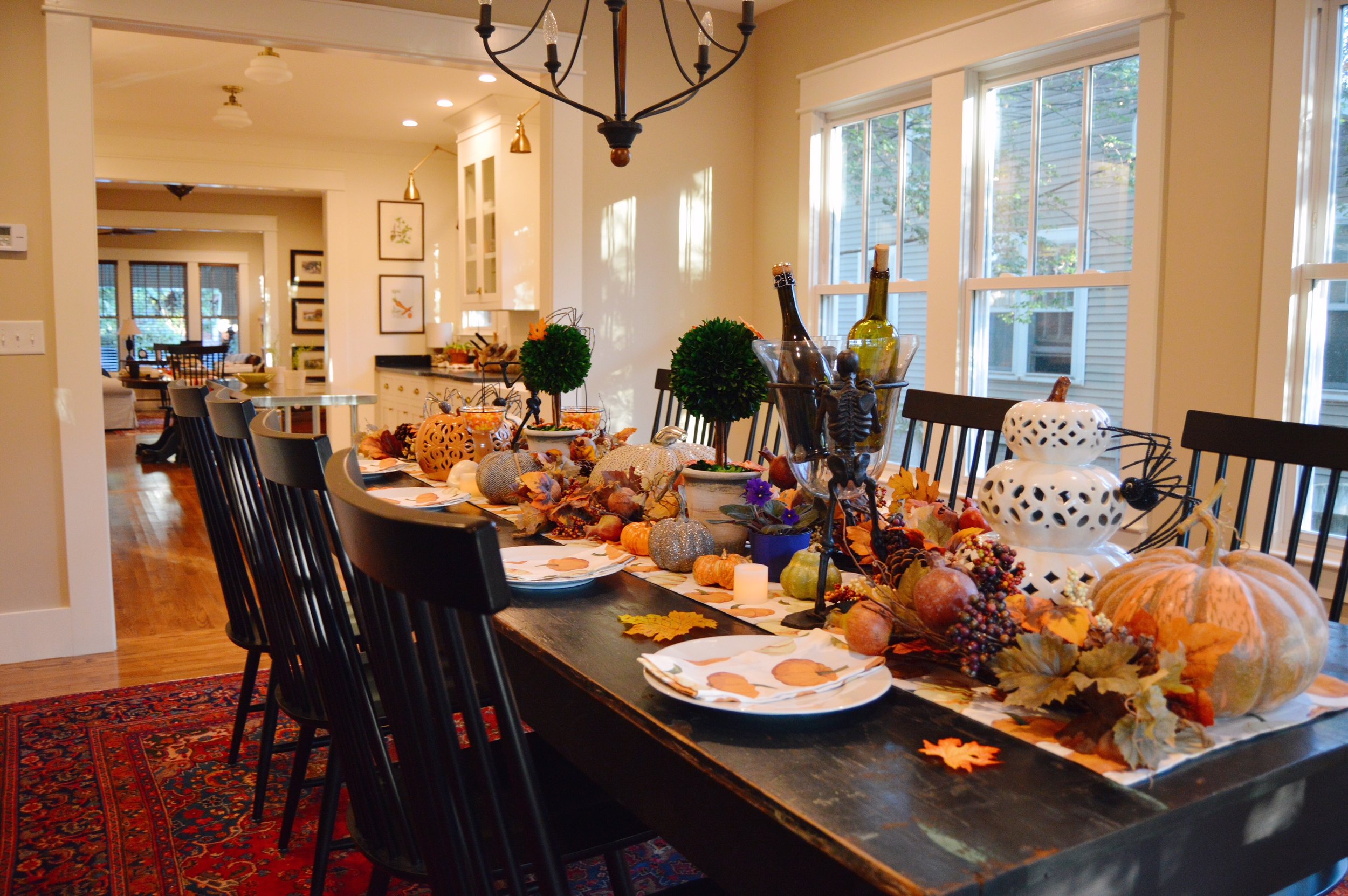
When setting up a tablescape, itโ€™s always best to start with the runner as the foundation, and build upon the rest from there. Once the runner is set, frame out your area by placing the topiaries where you want them on the table, usually about 2-3 feet apart depending on table size (ours is 9 ft). We placed faux fall leaves in the topiaries to make them more seasonal. Then, start placing your larger items on the table like the pumpkins and the seasonal decorations (the candy holder and wine holder). How cute are those "walking dead" condiment holders? We filled ours with candy corn for a fun, tis-the-season treat.

DSC_0568.jpg
DSC_0576.jpg

After the larger items are set, next place the garland since it will take up the majority of the space. We weaved ours around the pumpkins in a zigzag pattern so that it looked nice and full. Once you have the garland where you want it, begin filling in the empty spaces with the smaller items, such as candles, gourds, and little pumpkins. For a make-them-look-twice decoration, try adding these fun beaded spiders that are surprisingly life-like at first glance. They also let your guests know you don't take yourself too seriously ;).

C8CB0747-538E-4926-A8E6-85DB93A0EBDA.JPG
DSC_0546.jpg

After that, you can put the finishing touches on your tablescape by setting the table for guests. We went with a less formal feel by not placing silverware, but made sure that our napkins matched our runner for a custom look. As a fun little something extra, we sprinkled small, faux leaves around the table to give it a pop of color.

DSC_0577.jpg

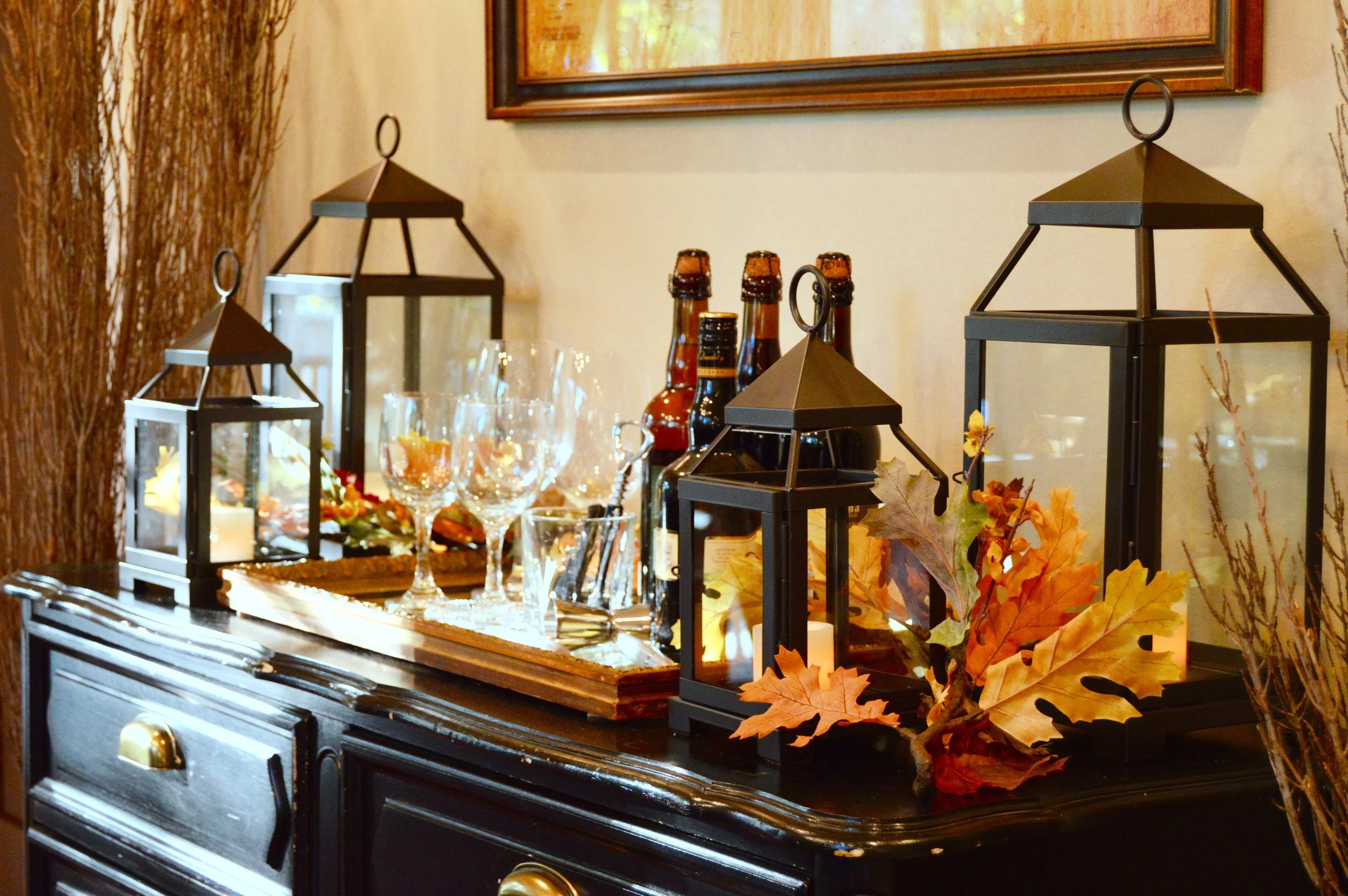
Since our dining room table was getting all of the attention, our buffet was looking a little sad and underwhelming, so next we turned our attention to it. We kept it simple, however, by adding lanterns with faux candles, fall garland, and vases flanking either side of it.

DSC_0497-2.jpg
5D659684-5101-4360-B51A-4F3BFF718CB9.JPG

We filled the vases with dried branches (we used Sky Pencil Japanese Holly). When styling a room we always like to incorporate hints of nature any way we can, whether itโ€™s live plants, faux plants, or even branches from your own backyard. Itโ€™s a simple way to bring the outside in!

DSC_0553.jpg
DSC_0572.jpg
805B5410-A333-4B02-BD01-796DF4BE5E78.JPG

Up next, we will turn our attention to the outside of your house to show you how to reuse these 7 items to make your front door/entryway feel welcoming and festive. We want to give a huge thank you to Pottery Barn for collaborating with us during our favorite time of the year! Stay tuned for part 2 of this series!

-Full list of products used-

ย 

ย 

We Started Decorating for Fall Because Duh

C5EB1894-6EF3-4FDB-9E5C-1F170E875540.JPG

It's not secret that fall is our favorite season. We've said it on here before and you will hear us saying it again (this is your official warning). It may be 92 degrees here in Tennessee but that doesn't stop us from plugging in pumpkin wallflowers and listening to the You've Got Mail soundtrack on repeat. So, we started adding a little more stuff around the house here and there and actually plan on giving y'all a fall house tour in the next couple of weeks after we post some collaborations we've been working on.

Our favorite is the jack-o-lantern pillow. It's just as comfy as it looks, too! We also added some faux pumpkins to the mantle as well as some branches from our back yard. Again, we plan on giving a full on tour here pretty soon, but we thought we would share this sneak peak for starters.

We hope y'all have a good weekend!

5 Sales Going on This Weekend

If y'all know us at all, you know that we don't ever buy anything at full price. We wait until things go on sale, or we hunt until we find it cheaper somewhere else. Have we ever mentioned that PJ is the king of deals? Like, seriously amazing at finding the most amazing pieces at half the price? Well, this weekend you can be the king of deals, too!

We've rounded up a couple of sites that are having sales this weekend and a few of the items we are digging from them. Check it out:

PB Pillow.jpg

Pottery Barn has this cute Halloween pillow that is cracking us up. Regularly $25.50, on sale for $20!

Army+Canvas+Laundry+Hamper.jpg

We're digging this Army canvas laundry hamper from Wayfair. There's something about a cool hamper that makes you want to do laundry isn't there? Regularly $28.95, on sale for $15.99!

backpack.jpg

Paraphrasing Nora Ephron, something about fall makes us want to buy school supplies. This backpack from Urban Outfitters is perfect for school or, as we like to do, using as an overnight bag when traveling. Right now it's 20% off!

wishbone.jpg

This one is sentimental to us, because PJ got this for Thomas' mom about a year ago. This brass wishbone from West Elm is the perfect back-to-school fall gift to wish someone luck on their first day. Regularly $19, on sale for $14.99!

mug.jpg

Lastly, how cool are these Optimist Monogram mugs from Anthropologie? Fall= new mugs every single year because it's just an unspoken rule, and these would be a fun new addition don't you think? Regularly $12, on sale for $7.95!

P.S. check out our new YouTube video here!

Our Guest Bedroom Collaboration with Pottery Barn

featured_pjandthomas01.jpg

Last month, we did a guest bedroom collaboration with Pottery Barn where we showed you 8 quick tips on how to refresh your guest bedroom (or any bedroom, really) by making some subtle, yet effective changes. We've been getting a lot of questions about the items we used, so today, we're sharing those tips on our blog along with what specific products we chose to refresh our upstairs guest bedroom. Here we go!

Tip 1

Mismatched bedside tables and lamps can make a room feel off-balance and visually askew. We love the look of using different pieces of furniture so that the room doesnโ€™t feel too matchy-matchy, but we do believe that matching lamps give the room a cohesive, intentional flow. These Chelsea Bedside Lamps in antique brass were the perfect mix of laid-back, casual, and sophisticated style that this room needed, and they look great beside the black metal of the bed frame and the brass pocket watch clock.

bedside_after.jpg

Tip 2

Sometimes simply moving furniture from one room to another can change how you use and see that piece. You may surprise yourself with how much you like it better in a different spot and, itโ€™s totally free!

We brought in some wood and metal shelves from an existing bathroom where it used to hold towels and washcloths, and we repurposed it as a bookshelf between the two chairs to create a guest room reading nook. The bench at the end of the bed with the cute SLEEP IN pillow on it was also in another room not really being used, but it looks like it was made to sit at the foot of the bed.

bench01.jpg

Tip 3

Having a spot where guests can sit down and unwind or lay their belongings/luggage is ideal. We used to have one chair that looked pretty lonely by itself, so switching it up for two cozy leather chairs not only created symmetry, it also added additional seating. The Greer Striped Pillows add that extra layer of comfort, and they basically beg people to sit down, relax, and maybe even read a book or two.

chair_after.jpg

Tip 4

Blank walls can make a room feel drab, uninviting, or even clinical. Creating a gallery wall of pictures in the space not only adds visual interest to the room, but it can make your guests feel more at-home, and even encourage conversation.

We grouped together old photographs of famous and intriguing people to create a small gallery wall that might make our guests stop to take a second look and discuss the people in the pictures. Plus, everyone loves a good gallery wall now and then!

gallery01.jpg

Tip 5

Make a splash with pops of color! While we designed the room with creams, whites, and shades of ivory, we also brought in pops of red throughout for that fun splash of color. From the striped pillows and the plants in the room, to the thoughtfully-selected books on the shelves, itโ€™s always a good idea to not leave the room too neutral-feeling. Have a little fun every now and then playing around with color!

chairs_001.jpg

Tip 6

Anticipating a guestโ€™s needs is one of the most important, impressive, and delightful things you can do as a host. Case in point: Guests donโ€™t always like to keep asking for the Wi-Fi password, so solve that issue before it becomes one by having it displayed in their room in an easy-to-find frame. Theyโ€™ll thank you for the clever touch, and youโ€™ll get bonus points for (almost) thinking of everything.

wifi01.jpg

Tip 7

When choosing the bedding for our guest room, we wanted it to feel luxurious but not too pretentious. Going with the Harley Stripe Reversible Duvet Cover was the perfect fit for this room because itโ€™s so casual, yet elegant-feeling (no seriously, you guys have to feel the linen/cotton blend because itโ€™s amazing). Did we mention itโ€™s reversible

The sheets we chose, the Belgian Flax Linen Sheet Set in Flagstone, feel every bit as comfortable as they look. When choosing bedding for a guest bedroom, itโ€™s important to go pretty neutral; nothing too feminine and nothing too masculine. Itโ€™s all about balance, and with Pottery Barnโ€™s choices of duvet covers and sheets, you pretty much canโ€™t go wrong.

bedding02.jpg

Tip 8

The colors you choose in your guest room โ€” or any space, really โ€” can have a powerful effect on how people feel when they stay overnight. Choosing a comforting, neutral color scheme layered with whites, creams, and browns creates a soothing and calming atmosphere where guests are sure to get a good nightโ€™s sleep. The linen curtains, white lamp shades, cream colored duvet cover, and brown leather chairs suggest this room is for one thing and one thing only: to slow down and relax.

bedding01.jpg

So there you have it! We had so much fun putting this together and are happy to finally share it over here. For more inspiration and drool-worthy pictures, head on over to Pottery Barn's blog!