This Movie is Giving Us Major Inspiration for the Kitchen at Holiday House

its-complicated-set-decor-dining.jpg

Good morning, friend!

The birds are chirping. The sun is shining. The coffee is hot. It’s a beautiful spring morning here at Holiday House! So, let’s do something fun and talk design, shall we?

My favorite part (and maybe PJ’s, too) of any renovation is the design process.

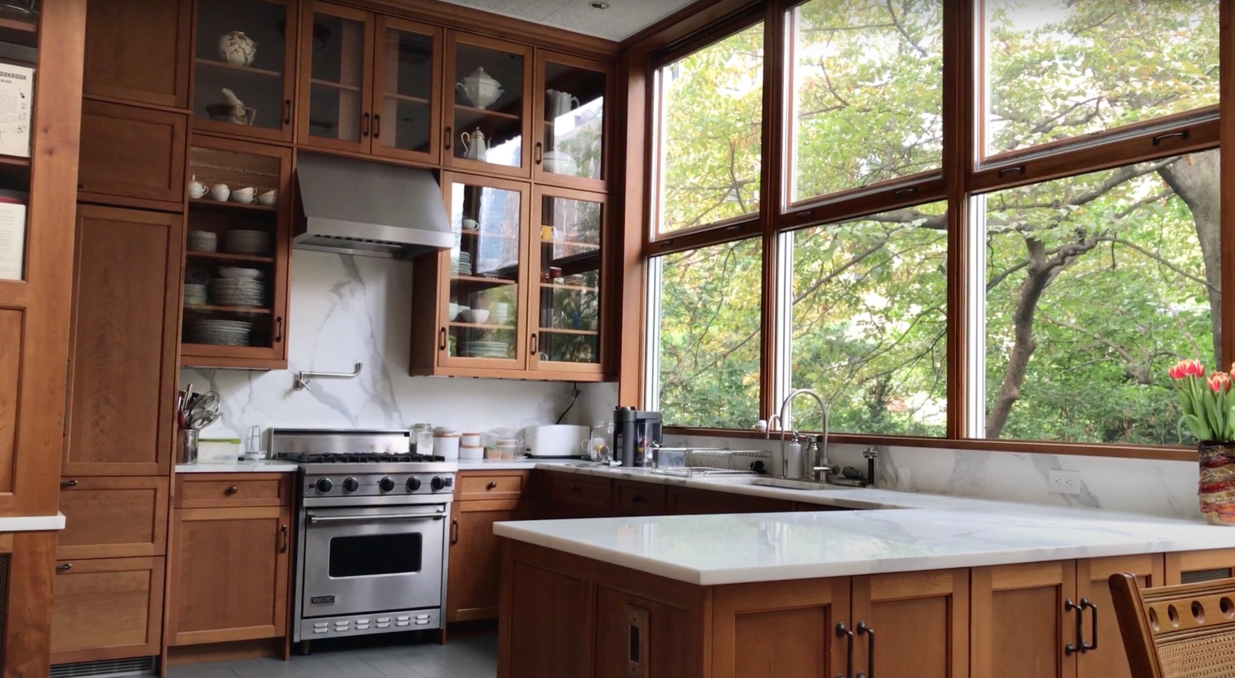
Though the time for picking out the finishings is still a ways off, I thought it would be fun to show you kind of where our heads are at as far as kitchen layout/style/feel for Holiday House. Have you seen the Nancy Myers’ classic It’s Complicated? I have always been so in love with Meryl Streep’s character’s kitchen in that movie, from the freestanding island with the marble countertop to the open shelving and sink skirt. What’s crazy, though, is that the layout of this kitchen matches Holiday House’s exactly, down to the stove up against the right wall (though, admittedly, the kitchen in the movie is a lot bigger than Holiday House’s and is nestled within a ginormous California Spanish-style ranch home that Grace, a baker, lives in).

IMG_6534.jpeg

I think the thing we both love about her kitchen is how pieced together it feels, like someone just put this here and that there and it magically turned out magazine-ready (though, obviously, it most definitely wasn’t, and a lot of precise care and design went into creating it on a soundstage). It just works. It’s not overly fancy, but it’s obviously gorgeous. It’s not pretentious, but it’s definitely sophisticated. It’s just a stunning, functional space where everything seems to fit in its place.

IMG_6535.jpeg
IMG_7201.jpg

Similar layouts, right?

We’re both envisioning a sort of very European-inspired kitchen when it comes to colors and overall feel, but one that also lends itself to the green, rolling hills of the farm and the sense of nature they bring.

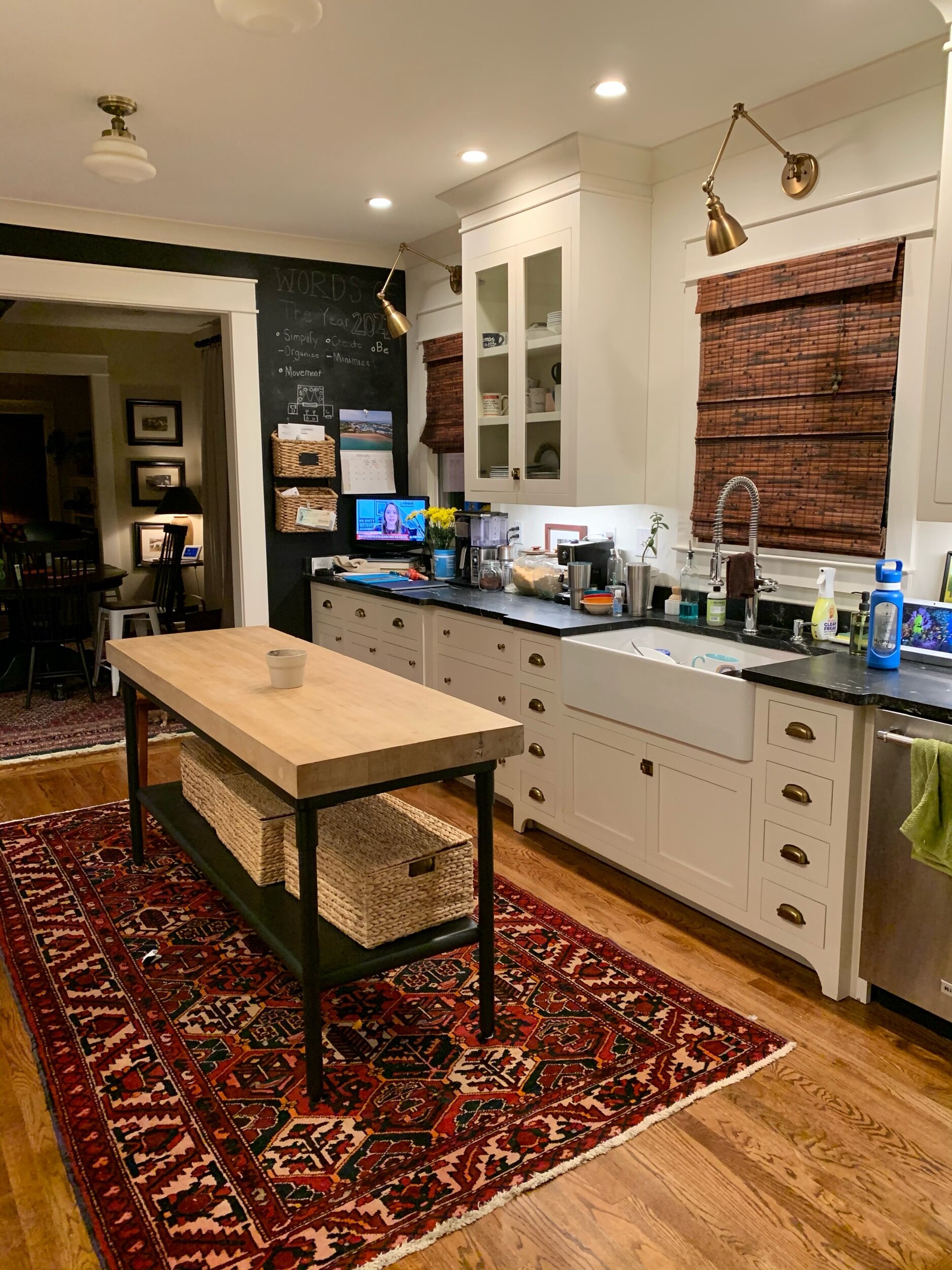
We want open shelving on the left side of the sink for easy access to the dishes we use the most. Upper cabinets almost always make a kitchen feel smaller (we have two big ones on the sink wall in our kitchen back at home, and while we love them, we’ve talked for years about removing them and putting open shelving there instead). We’ll also be putting a much, much bigger window over the sink area to let in even more light and to get a better view of the land outside.

PJ found an island on FB Marketplace a few months back that fits perfectly in the kitchen and is giving us so much more counter space. For a few months we weren’t able to use it because of the heater that was there before (and there was also an issue where there was a giant hole in the floor where a wall had previously been- an entirely different story- but PJ fixed it and all is well now), but thanks to PJ (always thanks to PJ!), he demoed and moved the heater so the island fits perfectly. It’s now where we all eat and where I make meals and it’s so nice to have more counter space. It also makes the kitchen feel like an actual kitchen! Weird how that happens.

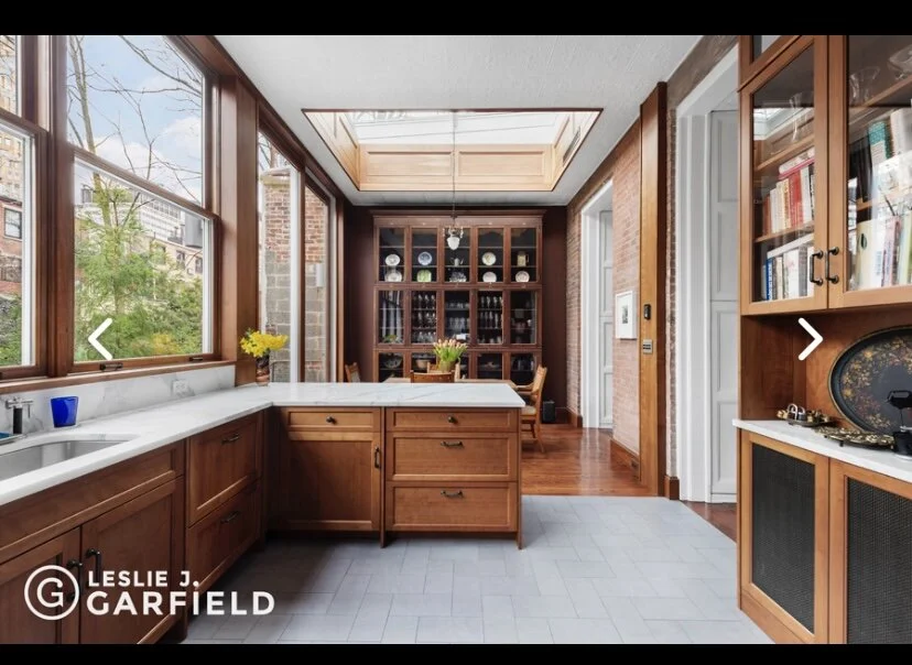
The new island will separate the kitchen from the dining room (again, just like the kitchen in It’s Complicated), similar to the picture below.

It's Complicated.png

PJ was working all weekend on Holiday House reframing walls and tearing down old paneling. I absolutely love to watch him work and come up with new ideas in his head that he then implements in almost lightning speed. We’re both so excited to have a functioning, enjoyable-to-be-in kitchen at Holiday House that the whole family can cook and eat in.

One day at a time!!!

(all images via Pinterest)

5 Comments

We Finished Painting the Exterior of The Downtown Cottage!

IMG_5971.jpeg

This post is sponsored by our friends at Benjamin Moore. All opinions are our own.

Before we begin, you can enter code MYSAVE10 during check out to save 10% on Benjamin Moore color samples, paint and supplies now through April 15, 2021 in the US only.  Terms & Conditions apply. Head to the Benjamin Moore Online Store for more info!


Y’all. This is not a drill. WE FINISHED PAINTING THE EXTERIOR OF THE DOWNTOWN COTTAGE. And we’re in love.

If you remember, when we bought the cottage two years ago, it looked like this:

1284538_0_UZiqBv_l.jpeg

The green color with that funky front addition and the off-center windows gave us nightmares. PJ always knew he wanted to rework the front and knew that ripping off the entry and coming up with a new color scheme was the winning recipe to completely transform this little house. He worked on the front all last summer, but stopped when it started getting wet, cold, and rainy during the winter months. This is what it looked like right before he took a break:

IMG_5964.jpeg
IMG_5963.jpeg

You can see he tore off that weird 1960’s front addition that ate up almost the entire front porch, added brand new windows, and framed in the new porch. And he did it all by himself (!). The kiddos and I had fun coming over to the cottage and seeing the progress and updates he was making every day. And I really mean every day. PJ is so fast when he works, even after 11 years of being together, it still blows my mind.

Anyway, now that spring has just about officially sprung here in Tennessee, it was time to resume work and get this thing finished. We’re simultaneously so close yet still have so much more to go, so right now it’s in that in-between phase, which can sometimes weirdly be the most fun.

When Benjamin Moore reached out to collaborate, we almost couldn’t believe it. We have been using their paint for years on our projects. Remember when we painted the guest bathroom at our old house Hale Navy HC-154? And all of the bathrooms, our kitchen, and now our living room in our home are all painted White Dove OC-17 (our absolute most favorite white ever). So when it came to their beautiful paint colors and this cottage, it’s safe to say we jumped at the opportunity to work with them, a company we’ve known and loved for many years.

IMG_5931.jpeg

Since this cottage is located in the heart of downtown, PJ really envisioned a sort of Americana theme when it came to the colors he wanted to use for the exterior. We had initially considered going with more of an earthy color scheme (similar to our home), but it ultimately didn’t feel right for this house. It’s so charming and cute and almost storybook-like, so an ode to the colors of our flag just made sense to him.

IMG_5926.jpeg

We used the Benjamin Moore Color Portfolio™ App to visualize what the exterior colors would look like together in real time. It’s seriously so cool! You take a picture in the app (or upload one you’ve already taken directly to the app) and then choose the Benjamin Moore paint color you want and “paint” it onto the picture with the “magic wand”. It’s surprisingly accurate and is an incredible way to play around with different colors until you land on the one that’s right for you and your overall vision.

We chose the Aura Exterior Paint in a Satin finish, which is formulated with proprietary Color Lock® Technology for rich colors that provide a beautiful finish and durability after repeated washings, so we knew it would not only look great, but it would hold up for many years.

IMG_5968.jpeg

Our starting point was choosing a color for the siding. We knew a white house would not only stand out on the street, it would be a classic choice that you would (hopefully) never get tired of coming home to. We debated on going with a different white than we normally do, like BM Chantilly Lace, or BM Cloud White (both gorgeous colors), but in the end, we settled on our tried and true favorite: White Dove OC-17. It’s such a versatile white: creamy, but not yellow; white, but not stark. It’s welcoming, and we knew it would be the perfect color for the downtown cottage.

IMG_5924.jpeg

Next came the shutters. Like I said, PJ really wanted an Americana, red, white and blue theme, so it was a no-brainer to do a navy on them. Call us creatures of habit, but we really loved the way our bathroom at our last house turned out, so we went with Benjamin Moore’s Hale Navy HC-154. It’s a deep, rich, true navy that couldn’t be more perfect if it tried. The way it pops against the White Dove siding gives us heart eyes. PJ made the shutters himself and I love how cottagey they make the house feel, especially painted Hale Navy.

IMG_5927.jpeg

After the shutters, it was time to make a statement with the door, and considering the only color of the flag we hadn’t used yet was red, we immediately knew what we had to do. Only, do you know how hard it is to find the perfect red? We poured through all of Benjamin Moore’s choices and thought we had settled on one (Raspberry Truffle), but right after we picked up a gallon of it, PJ found another color he liked even more at the last second. We ended up going with Benjamin Moore’s Caliente AF-290 and y’all. I can’t even. It’s so gorgeous. In person I find myself unable to stop staring at it, like a moth to a flame I am drawn in. We’re both smitten. So you heard it here, folks: if you’re looking for a gorgeous red that’ll stop you in your tracks, look no further than Benjamin Moore’s Caliente.

IMG_5928.jpeg

The last color choice we found on Benjamin Moore’s Color Portfolio App was for the front porch. Because the color scheme of red, white and blue was so obvious and bold, we wanted a quieter color as to not overshadow our three core colors. We went with Benjamin Moore’s Gray Huskie 1473, which is a really soft, neutral gray. We both love the way it doesn’t compete with the other colors; it stands on its own as a welcoming shade of gray that begs you to come on in (when it’s safe to visit others, of course).

IMG_5929.jpeg

Now that we’re finished painting the exterior of the cottage, we still have to install the front porch lights (they’re picked out, we just have to get around to putting them up) and landscape the yard, and then we can focus full time on finishing up the interior. PJ picked out all of the finishes and colors for the interior and I am SO excited to see it come together. I have a feeling we’re both going to wish we were living in this little cottage when we’re finished with it. 

IMG_5930.jpeg

We want to give a huge thank you to Benjamin Moore for partnering with us for this post. We feel so grateful to work with a company who not only inspires people to get creative (and also provides the tools to do so), but who we have admired and loved and actually used for so long. They make getting paint so easy, with both online or in-store pickup and delivery options. Just visit the website to order online or find a retailer near you. It’s truly been a dream come true for us to work with them, but stay tuned for more updates in the coming months as we finish out The Downtown Cottage for good!

Before we go, how about one more before & after?

Before:

IMG_5962.jpeg

And after:

IMG_5923.jpeg

So, so good.

14 Comments

Switching Things Up

63475026289__36A36254-AE7F-4C44-BFEC-5498744D653C.jpeg

**New rug alert**

“Perfect for spring!” as my older sister told me. And she’s right: just as the changing of the seasons bring change and new perspectives, the same can be felt simply by switching things up around the house. In this case, it was in the form of a seagrass rug PJ found for a steal off, what else? Facebook Marketplace, of course. The king of FB Marketplace strikes again!

Now we have two almost identical seagrass rugs in the two front rooms when you enter our house- one in the office and one in our living room. I am loving the brighter feel in there now, though we both loved our Persian rug so much (you may remember we moved that rug into our kitchen). It always felt extra cozy in there with our old rug down, but after it living in there for the last 4 years, it feels good to change things up, even if it’s only for a little while.

Here’s to new perspectives, no matter what forms they come in! Happy Monday dear friends xoxo

2 Comments

A Rug in the Kitchen

IMG_3890.jpeg

Speaking of kitchens, PJ borrowed the rug from our front room and put it in the kitchen last night (something he’s been wanting to try out for four years!) and I have thoughts about it. I have been very firmly against it forever, thinking it wouldn’t look good or that it would feel out of place, but I have to say…I actually quite like it.

The rug somehow makes the kitchen feel bigger, which you would think it would do the opposite, right? But no, it definitely feels more spacious in there now. Weird. It also feels good on my feet when I’m standing at the island making dinner- so much better than the hardwood floors. Will we keep it in here forever? Probably not, but you know how much we love to switch things up around the house, so my guess is it’ll be here for a little while. I love that my husband loves moving the house around as much as I do.

I did a poll on Instagram to see if people liked rugs in kitchens or not, and we received so many responses along the lines of “what about spills?” and “they’re a bad idea with kids!”. I’m not too worried about either of those potential scenarios to be honest. We have a rug in our dining room and the kids spill something on it every single day, and when they do, we just clean it up. That’s the great thing about Persian rugs: they hide all of the spills and messes that inevitably happen with five humans, two dogs, and one cat living under the same roof.

So right now, I’m all here for the rug in the kitchen. It’s 2021. There are literally zero rules anymore.

6 Comments

The Most Beautiful Kitchen I’ve Ever Seen

Screen Shot 2021-02-05 at 12.36.24 PM.jpeg

I am on Pinterest every day. We both are. And I constantly see white kitchens or kitchens with painted cabinetry and they’re all beautiful, of course, and trendy, and I would take any of them in a heart beat. But every now and then I come across a kitchen that literally makes my jaw drop, and this one, my friends, made me gasp out loud.

I actually didn’t even find it on Pinterest. I was randomly looking at homes in NYC (as one does) and found a gorgeous brownstone for sale in Brooklyn and when I came to the photos of the kitchen I instantly fell in love. Can you even handle the color of those stained cabinets? And the beautiful white countertops (thinking they’re quartz)? The contrast of the dark wood and light counters mixed with the huge windows, that probably make it feel like you’re actually cooking in the trees, is almost too much for me to handle, in the best way possible of course.

IMG_3384.jpeg

It seems white kitchens have been all the rage for the last decade, and we’re not complaining: our last two kitchens have white cabinets and black counters. But this kitchen makes a strong case for warm wood tones and dramatic white counters that extend up the backsplash of the stove wall. The glass fronts of the cabinets mimic the open feeling the windows and the extremely tall doors evoke, allowing a not-so-big space to feel bigger and more connected with the outdoors. Can you tell I’m obsessed?

IMG_3383.jpeg

If you have a spare $10,000,000, this kitchen, and the rest of the 7,600 sq ft brownstone can be yours. Just make sure to invite us over for dinner, okay?

photos via the listing by Ravi Kantha

4 Comments

A Serene Country Home in Spain

IMG_6708.jpeg

I have been dreaming about this home ever since I first saw it a few months back. How serene and relaxing is the white, tan, and cream color palette used throughout? It’s sophisticated and casual all at the same time. I wouldn’t change a thing. I’m getting major inspiration for Holiday House with the use of textures and layers and colors, and don’t even get me started on those raw wood doors!!

So dreamy.

IMG_6709.jpeg
IMG_6710.jpeg
IMG_6711.jpeg
IMG_6712.jpeg
IMG_6713.jpeg

All pictures via here.

9 Comments

When Do You Decorate for the Holidays?

68FE96DB-9E48-41EB-9A60-B74F9685EB64.jpeg

I ask this question in some capacity every year because I’m genuinely so curious as to how others do the holidays.

Normally, for us, as soon as Halloween is over and November 1st rolls around, we put away all the spiders and witches and candy and trade them for wreaths and bows and old-timey Christmas lights. We love Christmas (our favorite holiday) and want to celebrate it for as long as we can, which in our case means two months!

I know this is probably not the norm for most, and a lot of people don’t start decorating until December. But this year seems different. I’ve seen more and more people put up their holiday decorations earlier than usual in an (much needed) attempt to spread more cheer. It seems everyone is looking forward to enjoying the most wonderful time of the year (and all the warm, cozy feelings it brings) for as long as possible this year. Honestly, after 2020 has kicked pretty much everyone’s ass, couldn’t we all use a little more cheer?

So when do you decorate for the holidays? Do you start early like us or wait until December? Are you starting earlier than usual this year? Let’s discuss!

45 Comments

A French Apartment with a Monochromatic Color Scheme

IMG_6490.jpeg

I can’t stop staring at pictures of this stunning monochromatic apartment in Lyon. The use of various shades of whites and creams mixed with browns and black is my love language. It’s home to designers Pierre Emmanuel Martin & Stéphane Garotin of Maison Hand, and makes me want to pack us all up and move (even if it’s just for a few months) to France immediately.

But only if we can live in an apartment that looks like this one, even though it doesn’t look very kid-friendly, does it?

IMG_6503.jpeg
IMG_6504.jpeg

Swoon. You can see more photos over at Cool Chic Style Fashion.

Comment