5 Ways to Get Ready for Fall

5 Ways to Get Ready for Fall

Fall is finally here!

t may still be hot outside, but you can’t deny the light is slowly changing and the temps are starting to dip just a little. Fall is our favorite season, from the food to the clothes to all the house cozies. We look forward to it every year, and this year we’re extra excited because we’re finally settled in our house, and it feels like we’ll be here a while. It feels like home.

So we thought we’d discuss five ways to get yourself and your house ready for fall. Let’s dive in.

Read More
5 Comments

We're Giving Our Primary Bathroom a Refresh a Year and a Half Later

DSC00040.jpg

This is a sponsored conversation written by us on behalf of Delta® Faucet. The opinions and text are all ours.

Even though we just moved in a little over a year ago, we’re making big changes to our primary bath with the help of our friends at Delta.

DSC00047.jpg

When we renovated our home last year, it was for a television pilot and the filming schedule was STRICT. We had to have everything done in a tight time frame, and because of that, we weren’t able to completely renovate our primary bath the way we wanted to. We ended up going with two pedestal sinks in lieu of a double vanity because our cabinet maker didn’t have time to build the one we designed, and we went with less elevated faucets that were pretty, but not the exact ones we wanted for our primary bath.

DSC00050.jpg

So here we are, one year later and ready to tackle another renovation, though this time we’re just making subtle changes that will have a big payoff. Isn’t it crazy how changing one or two things in a room can completely transform a space? We love a good before and after and this one won’t disappoint. So let’s get right to it!

Our plan is to switch out our old faucets with a new, high-end Delta faucet that will better match the overall feel of this old craftsman style home of ours. We went with mostly traditional, classic style & décor in all of the other rooms in our house, and we want to make sure that cohesiveness is reflected in our master bath as well. For that reason, we’re going with the Delta Cassidy Collection. It’s more traditional (you know our feelings about traditional styling) and features clean lines & elegant design details, something we desperately wanted for our bathroom. We want the space to have that spa-like quality to it, a place where as soon as we walk in we immediately feel relaxed.

After we decided which collection we were going with, we began to look through the different options. In the end we confidently chose the Two Handle Widespread Bathroom Faucet with cross handles and we’re so glad we did!

We felt the classic shape of the cross handles, the beautiful curve of the tall spout, and the chrome finish were the perfect mix of old meets new. They have the glamour and high-end look we were craving and honestly would be something you would have originally seen (or a version of them, at least) when our house was built back in 1924. They won’t look out of place and are very much in line with the rest of the design of our house, and that was important to us.

Along with the faucets, we are also replacing the pedestal sinks with a wood stained double vanity for added storage. Like we mentioned, our cabinetmaker wasn’t able to get to that in time last year, so we’ve been living with two sinks that provide absolutely zero storage. We got by adding a small cabinet, which works alright, but even that isn’t ideal. It’s wobbly, so we leveled it by adding a flossing tool underneath the foot so it doesn’t shake. Comical, right?

DSC00053.jpg

While they’re charming and add a bit of an old school touch to the space, it will be nice to have somewhere to store towels and bathroom essentials so they’re not always out in the open. You can see the original drawing PJ did a year ago of what we had in mind for the vanity:

IMG_5649.JPG

We’re going with a Carrera marble countertop (to match our marble window ledge directly across from the vanity) and finishing the room off with chrome hardware to match the lights and faucets. We are also considering adding a few shelves to the bathroom for even more storage. Maybe above the toilet? Or a long one in the middle of the windows to set plants on? We haven’t decided entirely on that just yet, but we’ll let you know when we do.

What we DO know, however, is the feel we want our bathroom to have. We want it to feel like an oasis, like we’re bringing the outside in. Our biggest inspiration for this reno is water and the way we use it every day. We are going with natural elements with things like the slate-like floor tile, the wooden vanity, and the use of stone in our marble countertops. We plan to incorporate more plants in the finished space, too, to add a touch of nature because let’s be honest, every room deserves a little green here and there. To complete the room, we’re bringing in new washcloths and towels to freshen the space up.

We are so excited to get started on this project, y’all. The vanity has been built and was just installed a few days ago, and our brand new Delta faucets just came in the mail last week! This has been a year in the making and we can’t wait to show you the finished results. Stay tuned to see how it all comes together!

A Perfectly Cluttered Brooklyn Brownstone

IMG_5042.JPG

We came across this brownstone this past weekend and haven't been able to get it out of our minds since. 

We have a thing for Brooklyn brownstones (the character! the history! the layout!) and this one definitely doesn't disappoint. Is it not the most cozy-cluttered home, but in the best possible way? Loving the library sconces over the bookcases, and how about the chandelier that's shaped like an old pirate ship? Don't even get us started on that fireplace. 

IMG_5043.JPG

It's four stories, has five bedrooms, and is 16.5 ft wide. It was listed for $5.25 million back in Feb 2017 (wonder if it sold?) so it was/is a bit out of our price range, but we can dream can't we? 

PS: how to get the style of a Brooklyn brownstone in your own home.

It’s Not Fall Yet, But We Did Something Anyway...

It’s Not Fall Yet, But We Did Something Anyway...

The air has been considerably cooler lately and a false fall seems to be creeping in for a few days. With even the hint of fall, we couldn't help ourselves and did something to accelerate that feeling in our house.

Read More
8 Comments

How We Make a House a Home

How We Make a House a Home

You know how important home is and what it means to us. Home to us is a feeling; a feeling of love and comfort that you just can’t get anywhere else. But part of that feeling is having a home that reflects who you are and who/where you want to be.

Read More
4 Comments

Why The Right Lighting Can Make All The Difference

IMG_3765.JPG

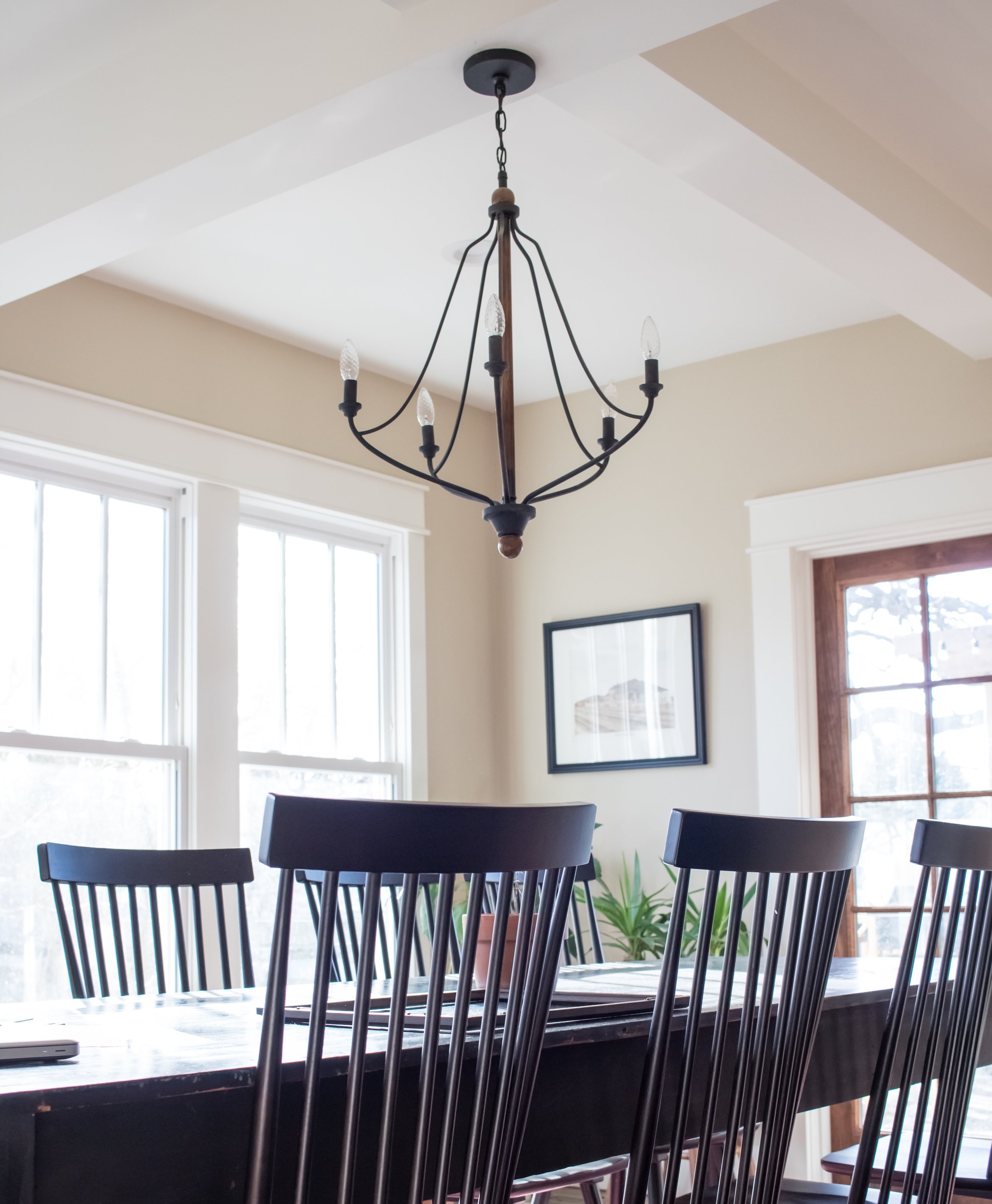
When we were working on our house for the show, we found a chandelier for our dining room that we both thought was so cute. The black and wood color matched the overall design of our dining room and had the look we wanted. We felt good about our purchase and loved it once it was installed. All was right in the world. Until it wasn't 

FullSizeRender.jpg

Our chandelier before

After being here a year, we realized we almost never turn that chandelier on when we're eating. We usually stick to either the overhead recessed lighting or the two sconces on the wall and our two lamps for a cozier, more inviting vibe. Why, you ask? (Assuming you asked us because you're on the edge of your seat wondering what happens next) The reason is because the light our chandelier put off was too. dang. stark. And bright. And harsh. In short, it hurt to look at and definitely didn’t feel inviting to eat under when it was on. 

FullSizeRender.jpg

Our chandelier before

Once we realized this we have been on the hunt for the perfect replacement ever since. We also wanted something more substantial. Our old chandelier felt too thin for the room. We needed something a little bulkier. You were beautiful to look at black & wood colored chandelier, but you just weren't the right fit for us.

Enter Hudson Valley Lighting. They have SO many options for every kind of light you can think of: wall sconces. flush mounts, pendants, table lamps, picture lighting, and of course, chandeliers. They offer literally thousands of different products from various companies so you're guaranteed to find the light you're looking for. It was actually really fun to go through all the options until we found the one we felt would look perfect in our dining room. And one of the best parts of the whole process was each chandelier usually has 2-3 different finishes to choose from, so you have some options.

IMG_3816.JPG
FullSizeRender.jpg

So more on why we chose the chandelier that we did. We were looking for an aged brass chandelier to offset our black sconces that we have above our buffet. We also wanted one that had shades on it to create a cozier atmosphere with more ambient lighting, lighting that would encourage intimate dinners with friends and family. After searching through so many lights, we finally settled on the perfect one.

FullSizeRender.jpg

We ended up choosing the Charlotte chandelier in aged brass and we absolutely love it. It's sophisticated, charming, and puts off the coziest, warm light that's been perfect for late night dinners. Also, aren't the little shades so cute? 

FullSizeRender.jpg

Also, the aged brass looks gorgeous against the black table and chairs. You know our favorite combination is black, wood white, and brass, as evident from our kitchen:

IMG_0414.JPG

If you're looking for your gorgeous lighting options for all rooms of your house you should definitely check out Hudson Valley Lighting. We are so in love with our new chandelier and we can't wait to get more lights for other rooms in our home!

IMG_3816.JPG

(This post is sponsored by Hudson Valley Lighting. Thank you for supporting the brands that we endorse.)

Comment

Friday Favorites

IMG_3320.JPG

Happy Friday!! How has your week been? PJ has been out of town all week working on an exciting new project with our friend Brian Patrick Flynn. With PJ gone, Thomas has been spending a lot of time with his family and catching up on some much needed house cleaning.

What are you up to this weekend? We have a few friends coming to stay with us, plus PJ gets back into town (!!!) so it should be a fun weekend. 

We've been digging some items recently and we can't get them out of our heads. We think you'll like them, too. Check them out below and click the pictures to shop!

This nautical inspired bedside table that we ordered two of for our guest bedroom. 

This fun-shaped wooden end table that we also recently got from Wayfair. It's even more beautiful in person.

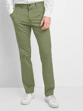
How fun are these linen pants from Gap? Perfect for summer don't you think?

We've been really into decorating with tans lately, so we can totally see this vase from Target on our bookshelves in our living room.

We're not normally into fake plants, but for $8, you can't beat this faux succulent that looks real enough that no one would even notice.

An oldie but goody, this lamp from Threshold is a cheaper alternative to similar lamps by Pottery Barn and West Elm. We have two of these lamps in our house and love them.

We hope you have a wonderful weekend, friend! 

Comment

We Finally Finished Our Front Guest Bedroom

EAED572A-F194-4508-BE74-B3D5F65B5B3B.JPG

If you have been following us for a least a year, you know our ongoing struggle to finally finish our front guest bedroom. When we first moved in, it was staged as a bedroom for the show, and looked like this:

IMG_9561.JPG

It was simple, clean, and honestly, not much to it. It did the job for what it was supposed to do, which was look like an upstairs bedroom as the camera showed it onscreen for maybe three seconds. After the show was over, though, it became something else. Something much, much worse. 

See, we moved into this house last year, but after we moved we still had some stuff over at our old house that we had to bring over. Why we didn't bring it all over in the first place? Honestly who knows. We think we were just so exhausted from the months of filming the show that we kind of took it easy for a second. Well, bad idea, because someone broke into our old house (where a lot of our stuff was still being stored) and stole a lot of stuff. It was bad and we felt so violated, but luckily it wasn't anything replaceable (though our old camera was stolen so, yikes).

After that, we moved everything into our current house and unfortunately, a lot of the stuff went into the front bedroom and it became a major junk room (which you can see footage of in the video below) for almost a year. You could barely walk through it and it always felt so overwhelming every time we went in there. 

Well, that feeling is no more! And you can walk through it just fine! We partnered up with Wayfair to help transform our guest bedroom into a room that our guests will actually enjoy staying in. We set a budget and surprisingly ended up sticking to it! We detailed it all in our YouTube video below, if you want to check it out.

 In the meantime, here’s how it all looks after we put it all together:

IMG_2965.JPG
IMG_2963.JPG

We wanted to go for a bright, classic look, so we used whites, blacks, warm wood tones, and blue got a fresh and somewhat coastal theme. This room gets the most beautiful light in the morning and we wanted the room to reflect that happy, positive feeling of waking up.

Again, you can check out the whole process in our newest YouTube video below! 

Comment

How Our House Looks One Year Later

FullSizeRender.jpg

We have officially lived in our house a year! How has time gone by this quickly? Okay technically it was a year on April 21st, the day after we finished filming our pilot episode, since we moved in the very next day. But time got away from us and we forgot to post, so here we are. A year and two weeks later.

We’ve loved living here, in this house and with our neighbors and over the last year have enjoyed making this house feel like a home. When we were fixing it up for all those months and then when we finally filmed the reveal, it didn’t feel like a home to us, really. There were cameras and lights and microphones and people walking in and out constantly, setting things up or helping put things in their place. It was wonderful and exciting, but again, it just didn’t feel like an actual home. It felt more like a movie set, actually. 

We tried to make it as homey looking as possible for the show, but with the perfectly placed flowers, the books with their spines turned around (since we can’t show the covers of the books on TV without the author’s permission), and the (beautiful) art that we were borrowing from our local museum, there was only so much we could do to make it feel homey. 

Which brings us to the present. A year later we have made this house a home, the way we want it to be and are settling in just fine. We’ve enjoyed making small changes here and there, but for the most part everything has stayed in its place. We thought it would fun to take a look back at how the house looked a year ago, when we staged it for TV, and compare how the house looks today now that it’s had people living in it for a year.

Our living room probably looks the most like it did whenever we staged it for the show. We have all of the same pieces in there but added an antique console table that was PJ's grandma's under the three windows on the left. We also put brown, faux wood blinds in there for privacy. Oh, but the biggest change in there is that we turned all of our books around! Like we said, we couldn't have them facing the camera, so we turned them all backwards so that the cream and yellow pages were all you could see. It's definitely ~a look~ and we can appreciate it, but it's not the look we really want in our living room.

IMG_2196.JPG

Staged for TV

FullSizeRender.jpg

Today

We staged the room below as sort of a "center hall", well, that's what we called it a least. Just a room that you pass through a decorate with pretty things. It didn't serve much use in the show, but these days we use it as a breakfast nook of sorts. We eat most of our meals here, especially when our dining room table is filled with clothes that need to be folded.

FullSizeRender.jpg

Staged for TV

IMG_0506.JPG

Today

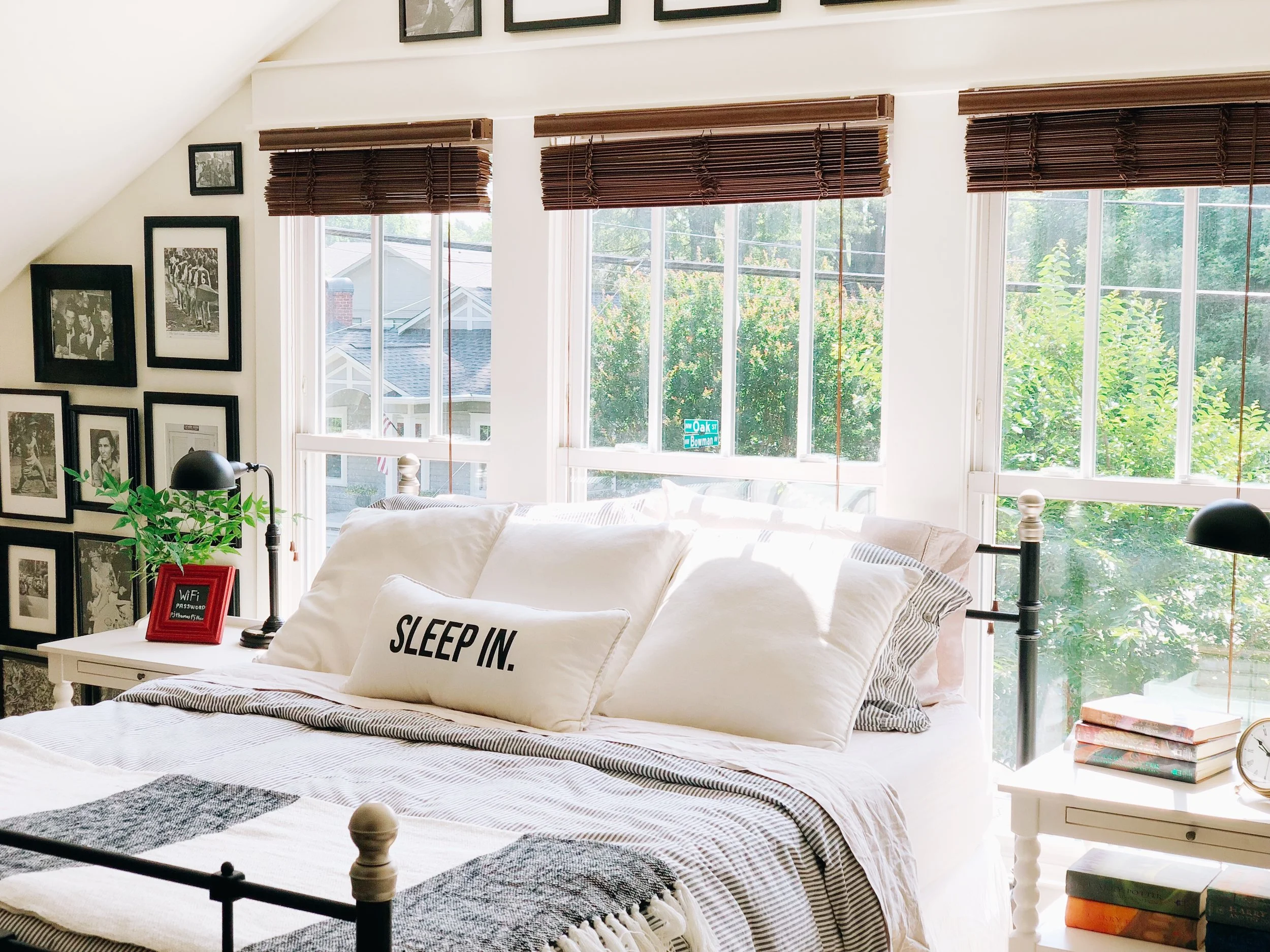
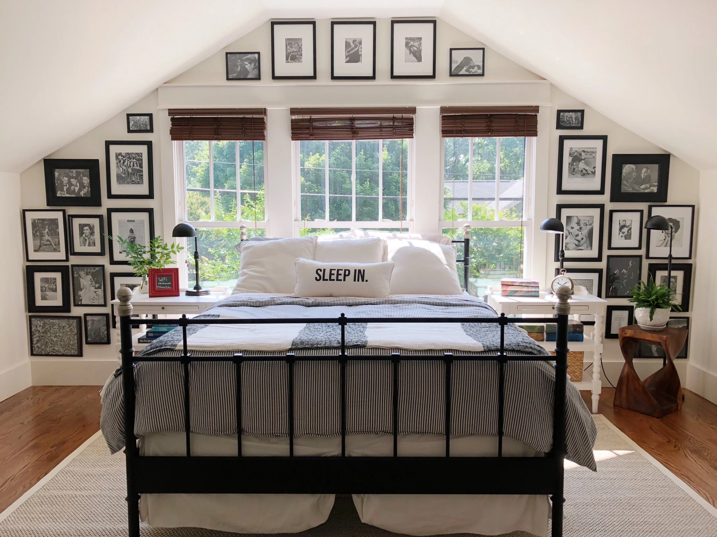
The master bedroom below almost looks the exact same, minus the addition of a few pictures, new lamps, and new bedside tables. Oh, and we switched out the rugs in here, too. We put our bedroom rug in our dining room since we felt it was too big for our room, and brought in the rug you see in the center hall above.

FullSizeRender.jpg

Staged for TV

IMG_2204.JPG

Today

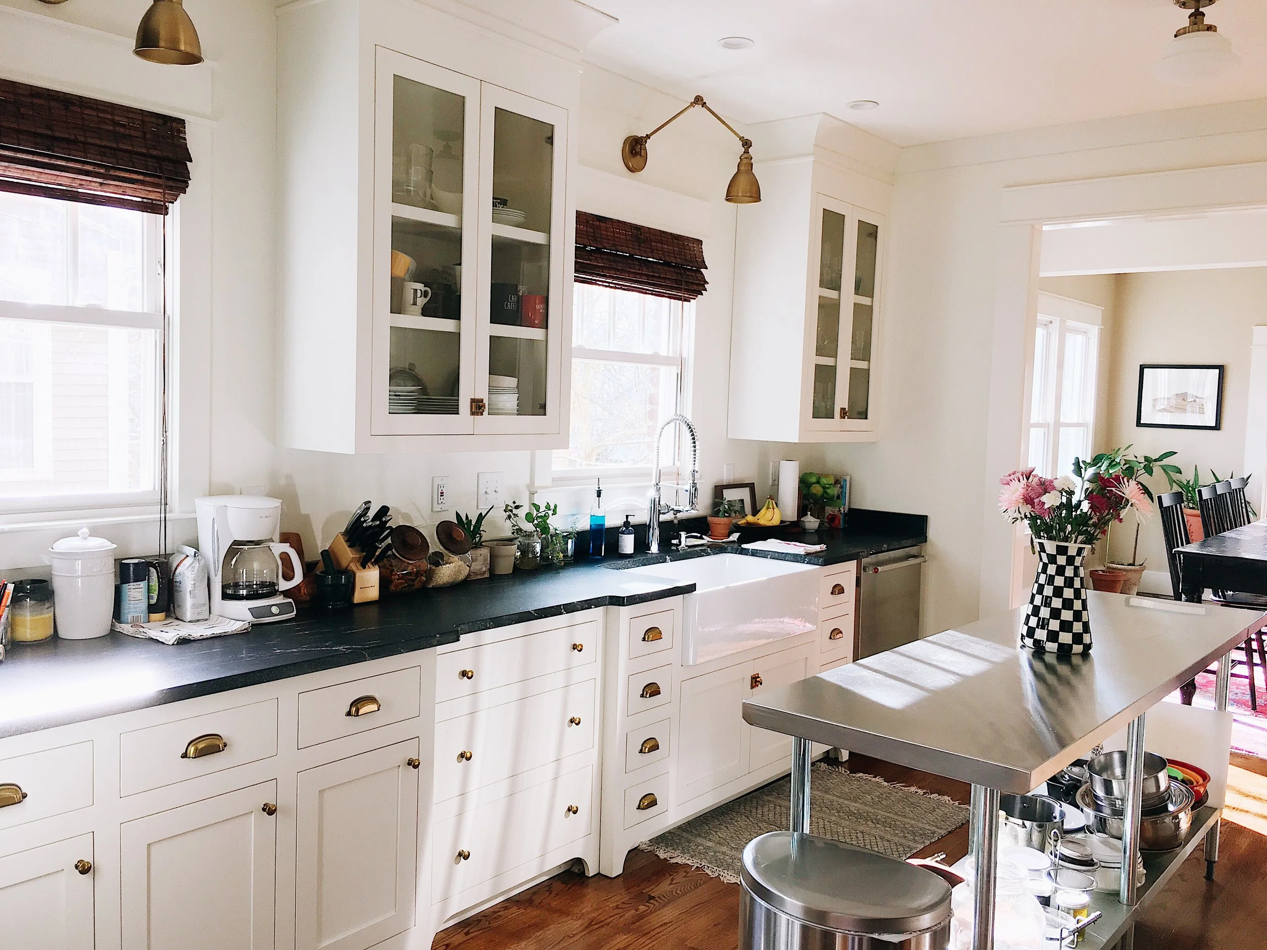
The kitchen is also pretty much the same, except we added some bamboo blinds for privacy and warmth/texture, and we brought in our stainless steel commercial island that we had in our last house. Fun fact: PJ had orginally built an island made out of wood that he salvaged from this house, but once it was completed and we got it in there, it ended up being too big, so now it lives on our back porch as a potting table/place to set food when we have guests.

FullSizeRender.jpg

Staged for TV

IMG_2205.JPG

Today

Hate that we didn't get a proper "before" shot of the kitchen from this angle, but the behind the scenes picture from the pilot will give you an idea of what it looked like. Our kitchen is almost completely white, so the chalkboard wall gives it a little bit more personality, visual interest, and makes it feel like we're in a coffee shop :).

IMG_2200.JPG
IMG_0465.JPG

Today

We staged the front room to the right as an office for the show, complete with the schoolhouse desk PJ found on the side of the road (!!!!), floor plans from our last house, and books. We actually kept it as an office for the first few months we lived here and had our TV room upstairs. We soon found out it was an inconvenience to go uptairs just to watch TV, when we didn't really go upstairs for any other reason, so we turned it into our den. In fact, we mostly keep the air turned off upsatirs (we're cheap, so what) when we don't have guests because we have everything we need on the main floor. Whiiiiiiiich is why we rarely take pictures of our upstairs and why you won't see any in today's post :). 

We are actually working on redoing some of the rooms and making them look more presentable so we will be back in a few weeks to show you all the progress we've made!!!

FullSizeRender.jpg

Staged for TV

IMG_2206.JPG

Today

IMG_0627.JPG

Today

Our master bath wasn't shown too much on the show, so we did minimal styling. Mostly just white towle and green plants sitting on our marble-topped window ledge. Since then we've added some affordable (and bright!) cafe curtains and a new storage cabinet between the two sinks. We were supposed to have a vanity instead of the double sinks, but our cabinet maker couldn't get to it in time before our deadline for the show, so alas, we are stuck with two sinks and little to no storage in our bathroom. There's something that's charming about the pedestal sinks but more storage and counter space would be sooooo nice. We plan to put an actual vanity in next year or so.

FullSizeRender.jpg

Staged for TV

FullSizeRender.jpg

Today

IMG_2228.JPG

Today

The hall bath REALLY wasn't shown on the show (like, at all) so all we did was throw a little rug in there. Notice how we didn't even put up a shower curtain. Everything is pretty much the same in there now, just with a shower curtain and a black and white picture of Marlon Brando above the toilet because, who wouldn't want to use the bathroom with Marlon Brando jumping in the air making a funny face?

FullSizeRender.jpg

Staged for TV

IMG_2225.JPG

Today

Our dining room in the back of the house. We originally built this room as a sun room, and then we reworked the windows and planned on making it a den/family room (since our office was in the front room on the right, remember?) BUT THEN we found the table. Ahh... the table. We had seen it at our favorite antique store for years and when it came time for the show, we knew we had to have it. We were able to get it for hundreds off asking price, because you should never pay full price for furnitire. EVER. The only problem is it was 12 ft long and wouldn't fit in the original dining room, so the only room it would fit in is the new den/family room, which was an addition. So, we added a chandelier and had our trim guy cut it down 3 ft to make it a 9 foot table (because 12 ft was still too long for that room!!) and that's the story of it. Below the before/now pics, you can see what it looked like when we first put it in the room to see if it would fit. 

FullSizeRender.jpg

Staged for TV

IMG_2229.JPG

Today. We've actually done more to the dining room since this picture was taken back in February, like adding bamboo woven blinds, more pictures, and more plants. Currently our table is buried under a mountain of clothes, so we'll stick with this older picture for now :) 

FullSizeRender.jpg
FullSizeRender.jpg

So that's it! This was a long post but a fun one to look back on and compare. We're just showing you the downstairs for now, minus the laundry room which we are still setting it up the way we want it to look, but that wasn't shown on the show anyway. We plan to show the upstairs once we get that completed, again, hopefully in the next couple of weeks.

Which look do you prefer? Staged for TV or "lived" in?

Design Dilemma

IMG_2151.JPG

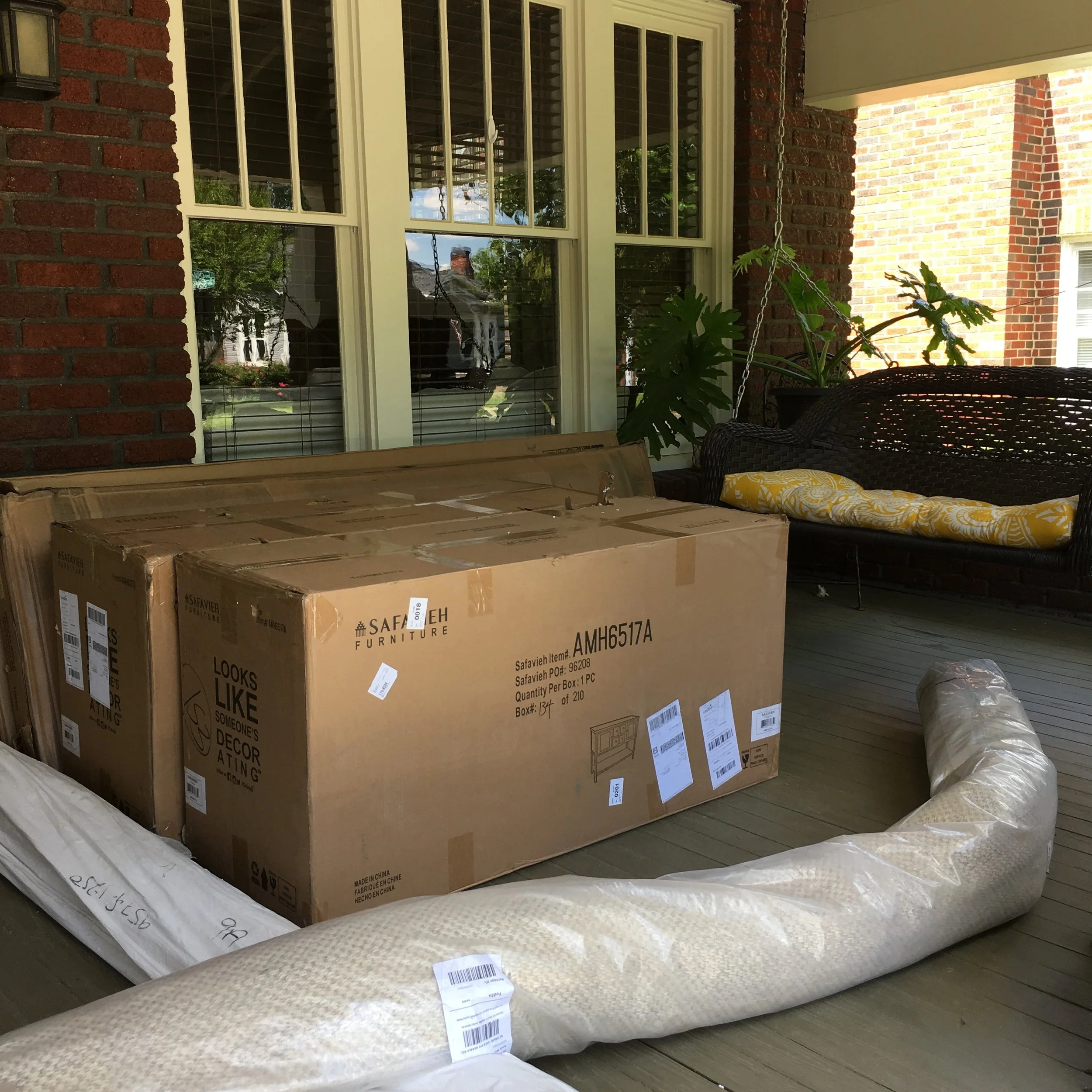
Yesterday we came home to find a ton of furniture we ordered online sitting on our front porch. Finally! We were so excited because we had spent so long picking out each piece and deciding where we wanted it to go in our house. We ordered a bunch of different things for a few rooms and had spent almost a month choosing just the right pieces.

When we got them inside and started opening them and putting them together, we felt really good about everything. It was cool to see it all in person and finally in the rooms after spending so much time ooo-ing and ahhh-ing over them online. 

IMG_2138.JPG

We set up one of the rooms with the furniture all in its place and stepped back to admire the view and...... well it didn't really look all that good to be honest. We were upset. We had spent sooooo much time going over the floorplan and where this and that would go and now that everything was in its place, it just felt off. It didn't have the look/feel that we were going for and we couldn't figure out why.

This isn't going to be one of those posts where we tell you our dilemma and then by the end of it we reassure you that everything is fine because we figured it out and blah blah blah. Nope. This is the kind of still-working-on-it post where we haven't 100% found the solution yet. We ended up rearranging the whole layout of the room in question and it made it somewhat better, and we still have to bring in accessories like art, lamps, and ~decorative~ items. But still, as of right now, we've kind of hit a wall creatively.

When that happens, we like to clear the room out and go back to the basics, back to what we had originally envisioned and see what we need and don't need to achieve that vision. We worked on it until late last night so a good part of our frustration with the room could have been that we were just tired and needed a fresh mind/start. We have a whole blog post/YouTube video about the process coming soon, so we can't reveal too much now, but we'll keep you updated about the final outcome. Do you ever go through moments of design frustration like this? 

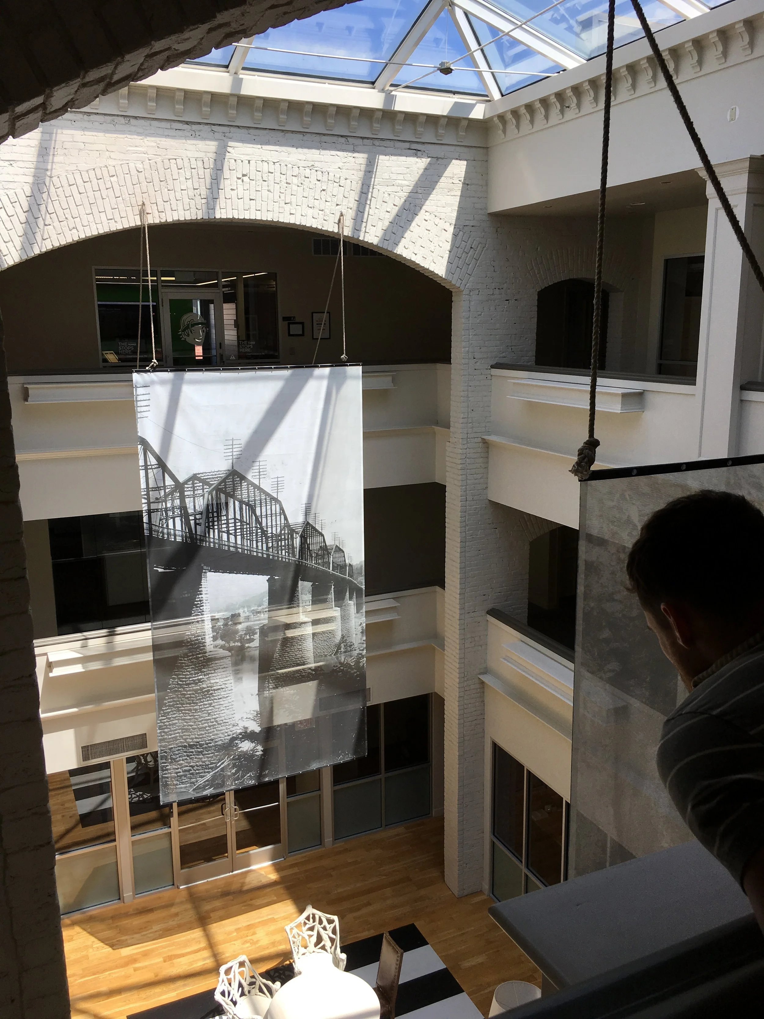
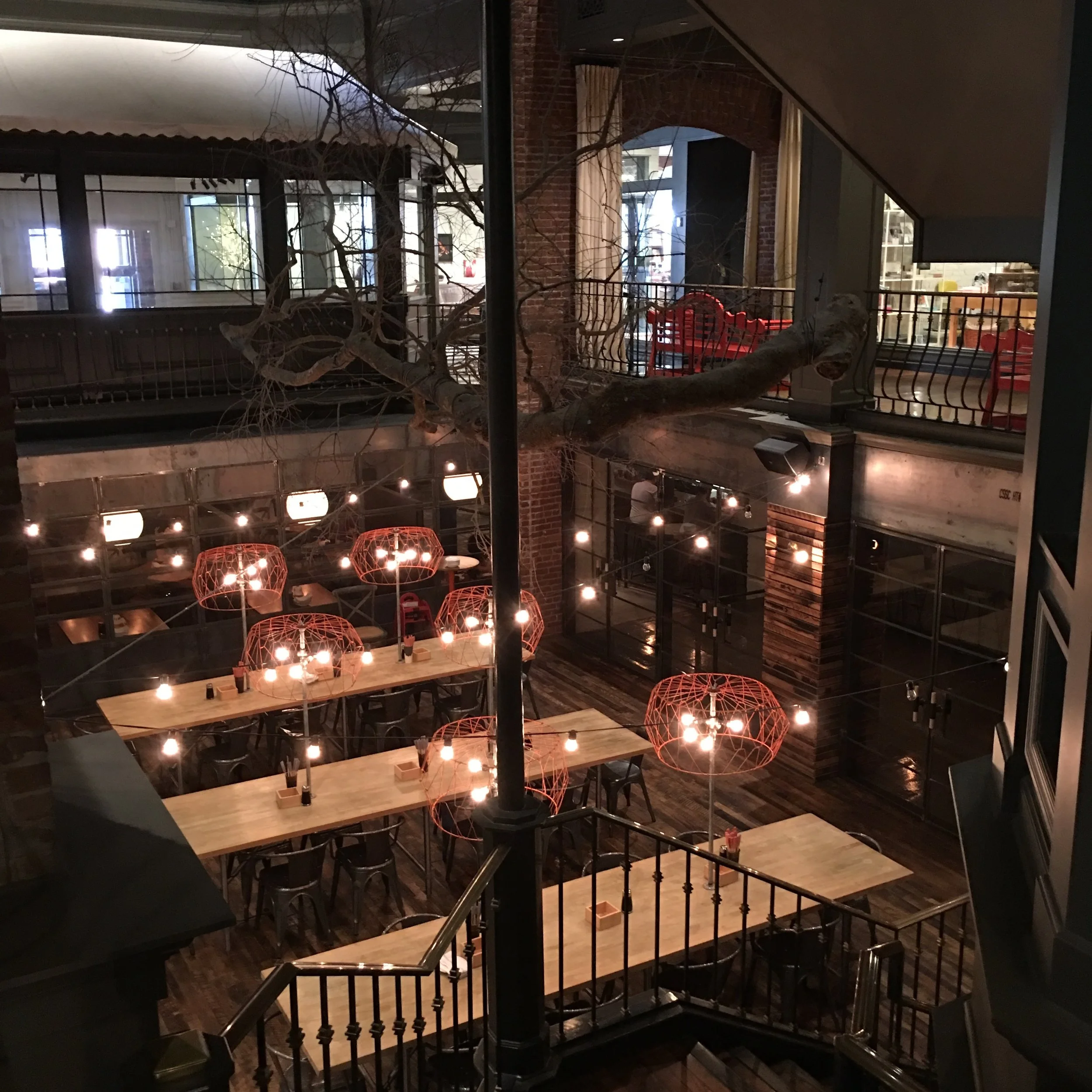
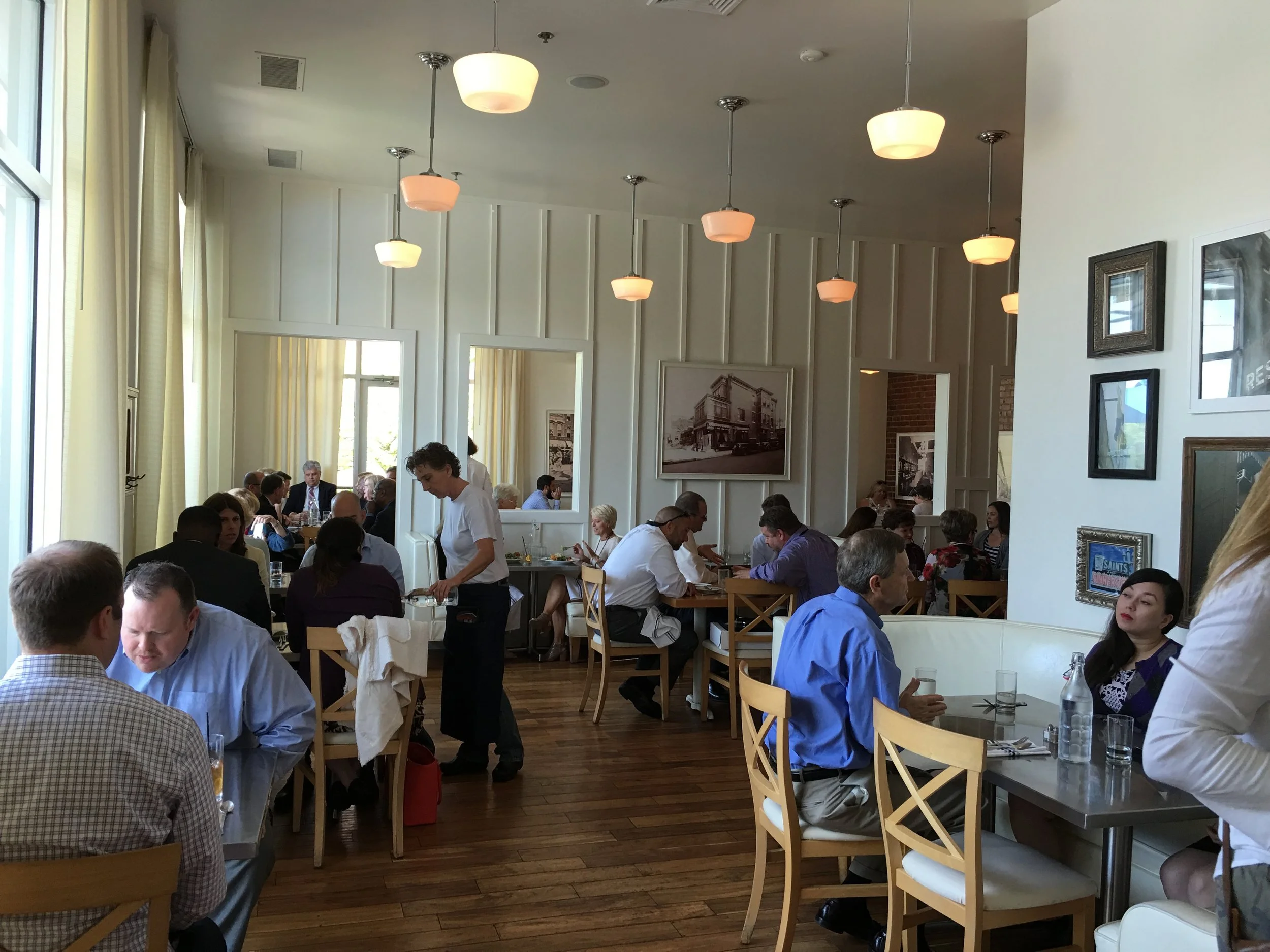
In other non-design related news, we went to lunch yesterday in Warehouse Row in downtown Chattanooga with a few friends and felt like we were in New York City for a few hours. Have you ever been? It's absolutely gorgeous.

IMG_2134.JPG
IMG_2135.JPG
IMG_2136.JPG

We ate at Public House (above) and noticed they have the same schoolhouse pendant lights that we have in our upstairs bathroom!

After lunch we went to look at a potential flip house. It doesn't look like much now, but it has a great layout and could be sooooo cute. We already have so many ideas for it. We'll keep you posted on what happens with it!! Fingers crossed!!

IMG_2141.JPG
Comment

Estate Sale Treasures

IMG_1895.JPG

If you follow us on Instagram, you know we went to one hell of an estate sale this weekend. We showed y’all the house and grounds (and to be honest, we might do a whole separate post on those two things alone because holy cow!!) as well as some of the items we found that we ended up bringing home with us.

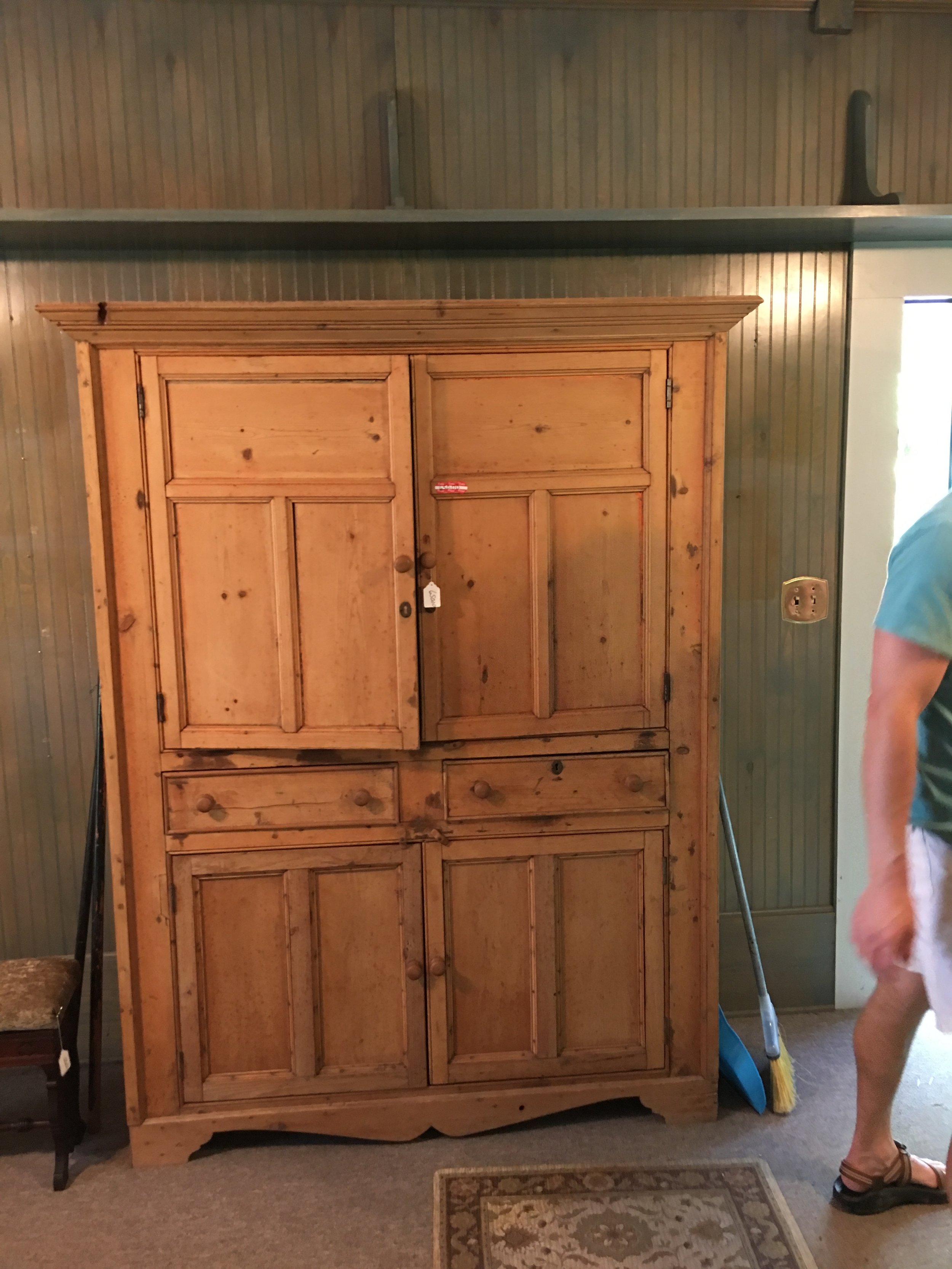
We got a couple of lamps, trinkets, and baskets, but by far our favorite purchase, which may be our favorite piece of furniture we’ve ever bought, was the big hutch you see in the corner up there. When we went the first day, we posted a picture of the hutch to our story and SO many of y’all told us to get it. We thought about it so much but at the end of the day we decided not to spend the money, so we left with the items we mentioned above, and no hutch. 

We went back the second day, Sunday, which was the last day of the estate sale, just to make sure we really didn’t want the hutch. There were actually two hutches that we wanted but we didn’t put the other one on Instagram. It was bigger and for some reason $100 less than the one we ended up buying. We thought about using it in the upstairs bathroom as a linen and towel closet.

IMG_1865.JPG

We offered a price we would be willing to pay if we bought both of them, but they didn’t agree to it, so we chose the one we loved the most and brought it home. We are somewhat kicking ourselves today knowing we didn’t just get both of them, BUT we feel good about our purchase of just the one, especially since we got it for $250 off asking price.  

Here are some of the other pieces we got from the sale this weekend:​

IMG_1899.JPG

​The metal lamp with the orange empire shade that somehow perfectly matches the shades of our sconces we have throughout the house. PJ was iffy on it but Thomas absolutely loved it, so for $10 it was ours. We also took home the turquoise statue in the top right corner. Not sure about the placement, but it’s living there for now.

IMG_1898.JPG

How cool is that gold and black lamp? We got it for $15 and knew exactly where we wanted it to go before we even bought it. The shade was painted black with fabric paint and the base was painted gold. Wonder what color the whole thing was originally?​

IMG_1897.JPG

We also picked up this wooden stand for around $40. There was a giant crack down the middle so on Sunday morning PJ took it apart and is currently in the process of repairing it. This is what it looks like at the moment: 

IMG_1900.JPG

Hopefully it will be repaired and ready to go in the next couple of days. Not sure where it’s going just yet. Maybe in the dining room with a really pretty plant on it? 

So that was where the majority of our weekend was spent! If you’re looking for great, one of a kind pieces for not a lot of money, you should check out estate sales every now and then. We’ve gotten so many pieces in our house from estate sales and we can’t recommend them enough. Happy hunting! 

One Trick We Tried to Get a Better Night's Sleep

IMG_0633.JPG

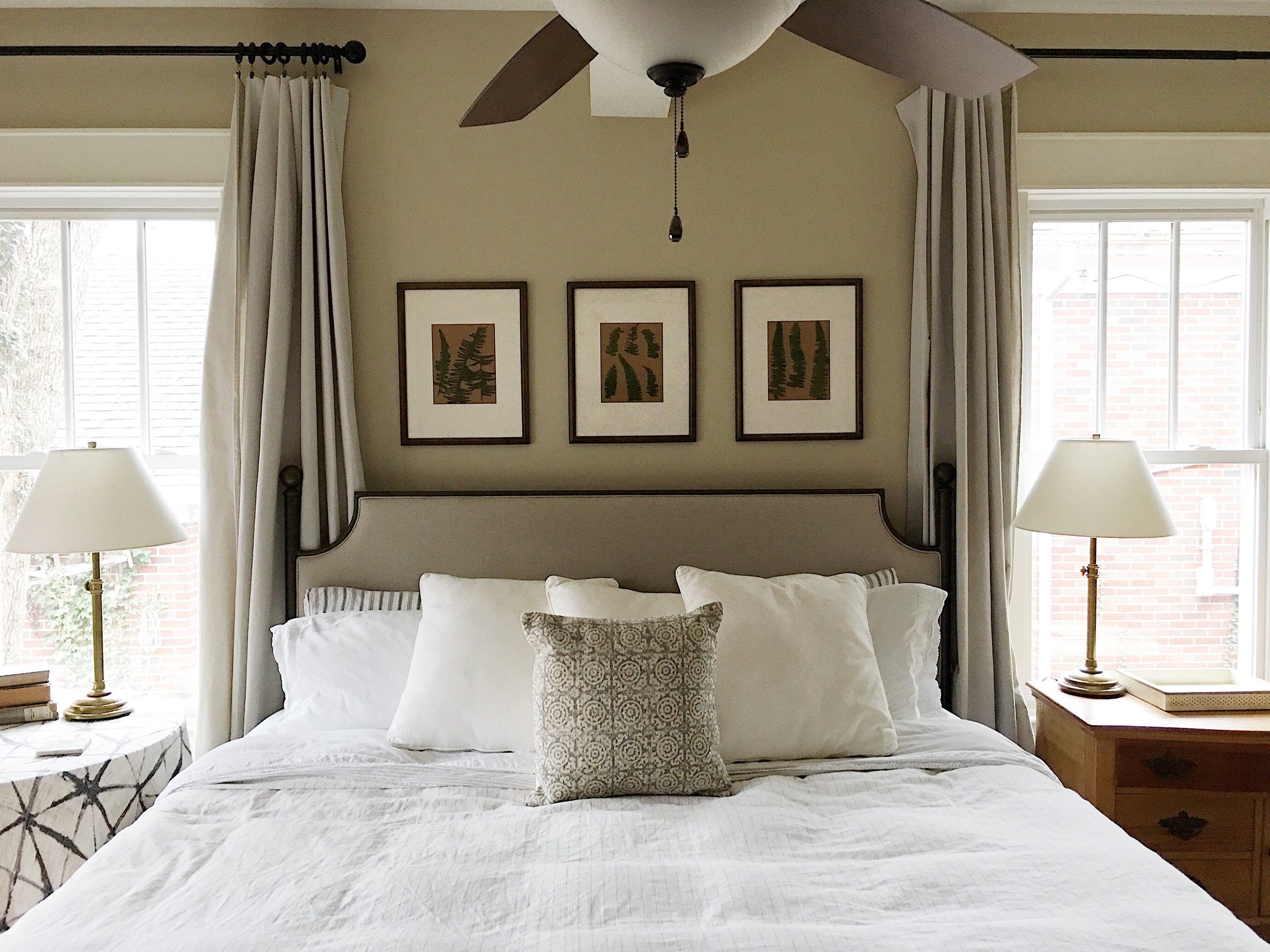
One of the first purchases we made when we moved into our house last year was buy a bigger mattress. At the time, we still let our two little dogs sleep with us and, with a queen sized bed and four sleeping in it, things were getting tight. 

We made the decision to buy a king sized mattress and then started making the girls sleep on their own bed in the laundry room and it changed everything. It was glorious. Such a better night’s sleep! But we made another decision that’s made all the difference, too: every few months, we started switching which sides of the bed we slept on.

PJ suggested it one day, a couple of months in, just when we were getting used to sleeping on a new bed in a new house. We were both skeptical at first, but changing everything up turned out to be just what the doctor ordered. We're both so used to sleeping on one side each night that our bodies had grown accustomed to laying a certain way, and sometimes we would even wake up sore. 

Switching sides of the bed gives you and your partner the chance to experience how it feels to sleep in different directions and hopefully find the one that both of you agree on. If you don't like your side of the bed once you make the switch, you can change it in a month or two. This article  gives some statistics conducted by Saatva Mattress (a luxury mattress company) that we found interesting:

  • Right side sleeping males feel relaxed instead of stressed most of the time when compared to men sleeping on the left (71% vs. 60%)
  • Almost half (46%) say that when they first got together as a couple, both partners preferred the same side of the bed and 79% of them had to concede their preferred side to their partner.

Pretty crazy, right? Do you switch sides of the bed with your partner regularly? If not, give it a try! You might be surprised with how good you'll start sleeping.

(Bed from here. Lamps from here. Duvet from here.) 


Design Sponge House Tour

FullSizeRender.jpg

So, something amazing happened. Sort of a dream come true, really. Last week our house was featured on Design*Sponge and we collectively lost our minds. Like everyone else, we've been following D*S for YEARS and have fallen in love with the blog's house tours and essays. We were so flattered when they agreed to feature our house and tell a little bit about our family's history with it!

Now that the tour is up, we will be updating the house tour page on our blog to reflect our current home, but the other one will still be available to tour as well. We also plan to do a YouTube tour pretty soon, we just have to wait for a pretty day and sadly, we're pretty short on those lately.

Thank you Garrett at Design*Sponge and for our photographer Golden who helped put this together with us! Y'all can click here to see some before and afters and read a little bit about the back story with our house on Design*Sponge!

We’re Obsessed with the Style From “Call Me By Your Name”

3429.jpg

Have you seen Call Me By Your Name? The film was nominated for 4 Oscars this year, including Best Picture, and won for Best Adapted Screenplay, though, we think it should have won in another category, too: Best Costume Design.

Even though it's still getting down to the 30's here on some days, we're daydreaming about warmer weather when we can wear the Oxfords, Polo's, and shorts like Elio and Oliver do. The film is set in 1983 but the style still seems classic and very doable today. It's all about short shorts, over-sized short sleeve button downs, and some slip-on boat shoes. Since Spring starts tomorrow, it seems like the perfect time to get our wardrobe together for the next couple of months.

Below, we've rounded up some items YOU can wear this summer to achieve the CMBYN look, too:


(above photo via here)

Are You Watching Queer Eye?

tmp_pZyo3A_6d5400bbac4a579a_QESI-GB_POP-GROUP_3859R_1_.jpg

Ever since we finished Shameless, we have been fixated with another show on Netflix. The new Queer Eye reboot is SO GOOD and has a completely different feel from the original. This isn't your mother's Queer Eye for the Straight Guy (assuming she watched it?).

This time, they don't just focus on making over straight guys. They feature gay men AND straight men who want to change their lives for the better. Maybe they're stuck in a rut they can't get out of or struggling to come to terms with themselves. Every episode we laugh until we cry, then we actually cry. 

Each member of the Fab Five specialize in their own area of expertise (grooming, culture, clothes, food, and design) and each bring something fun and unique to the table. Our favorite? Jonathan, who focuses on grooming. He's hilarious and says the most ridiculous yet relatable things you've ever heard. The show is worth watching just for him alone, but you come away with a valuable and meaningful lesson after every episode. We can't get enough and can't wait for season 2 already! 

If you haven't watched it yet, we highly recommend checking it out!

(picture via here)

Breakfast Room Progress

IMG_9436.JPG

The room in the center of our house has had a couple of names since we moved in. At first we called it "the library", because we were going to put bookshelves in eventually. Eventually has now turned into "umm maybe YEARS down the line or possibly never, whichever comes first." We had a rug in there when we first moved in that has since moved to our bedroom. Below is how it looked on our TV pilot "Down to the Studs".

FullSizeRender.jpg

So then we called it "the center hall" because, well, it's in the center of our house and we only used it as a hallway to pass through to get to other rooms in the house. We didn't have any chairs around it then and it felt very staged. You can see that phase below.

IMG_9440.JPG

Now, we call it "the breakfast room" because we currently have chairs around the table and eat most of our meals there. We have a 9 ft dining room table (in the back of the picture above) that we usually only eat at for special occasions. Otherwise, you'll mostly find us eating at this table in the room of a thousand names. 

We've been very slowly filling it with frames and plan on doing some more above the table with the lamp on it to the right. This room gets the most amazing light in the winter and is right between the living room and the kitchen, so you feel like you're right in the middle of all the action. A room that we weren't sure what to do with when we moved in has suddenly become the central hub of the house.

Sometimes it just takes living in a house to get a feel and understand each room, you know? We plan on doing that a lot this year :).

Sources:


A Chalkboard Wall

Kitchen.jpeg

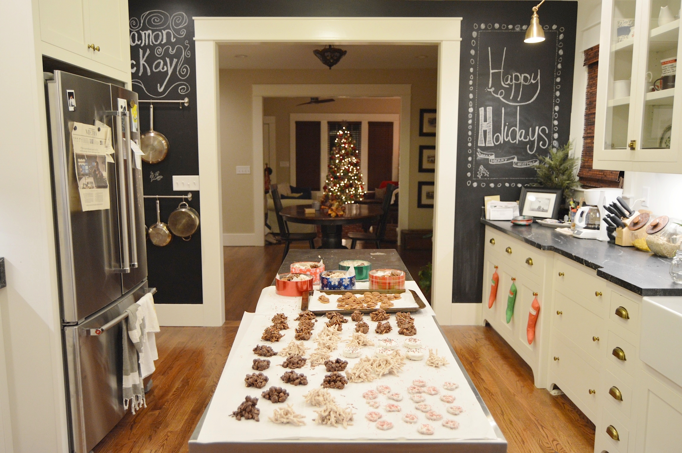
We did it. We finally did it! We painted our kitchen wall in chalkboard paint. 

We went back and forth for months on if we should actually do it or not, weighing the pros and most certainly the cons (it's a trend! it will make the kitchen too dark! chalkboard walls were so 5 years ago!) over and over again. We even asked you guys what you thought about it on an Instagram story, with most of you saying no ;). But then we thought, what if we just tried it?

That's the great thing about paint, if you don't like it you can change it in a day, even if it takes you a few coats. In the end, we are so happy we made the jump and just did it. It makes the kitchen fun and, as our friend Anne said, it says we don't take ourselves too seriously. Thomas' mom has a huge chalkboard wall in her kitchen and over the years friends and family have filled it with their signatures and loving messages. You may have seen it in a few of our pictures from time to time.

FullSizeRender.jpg

Are chalkboard walls a trend? Probably. We tend to stay away from trends, but there is something so homey and inviting about a chalkboard wall, don't you think? And we love the industrial feel it gives our kitchen with the pots hanging up against it. It may not last forever, but for now we are glad we went with it. Follow your gut despite what anyone else says. It's your home, after all. There are no "rules" so we've always said do what you feel happy and right about doing and nothing else matters. 

We have a YouTube video coming out soon about the actual process of painting it and some tips for you if you want to do your own chalkboard wall, so stay tuned! Also,  pictured above are some sweet, no-bake treats we made last night. There may or may not be a YouTube video about those coming out even sooner ;).

A White, Black, and Brown Kitchen

051916_DarrylCarterHome_1.jpg

We've seen this kitchen pop up on Pinterest so much lately and it's left us completely in awe. So, after probably the fourth time of coming across it, we decided to track it down and see who's it was.

Turns out, it belongs to designer Daryl Carter and is located in Washington D.C. He bought the home in 1997 and has since redecorated it multiple times, but we hope it stays the way it is now for a while. We love the sophisticated, collected, artsy feel throughout; with statues and sculptures and books in almost every room.
The kitchen is by far our favorite room, though. It's that perfect mix of warm and cool, industrial yet lived in. The marble counters are a beautiful contrast to the black cabinets, while the stained wood island with an iron étagère on top of it gives it warmth, depth. The range (!!!!) with the stainless steel hood, glass front cabinets, and the shelving unit in the middle of the island really make it feel like a commercial restaurant kitchen, don't they? You wouldn't think that putting giant shelves on top of your island in the middle of your kitchen would ever work but they definitely -make- this kitchen 100 times cooler. 

051916_DarrylCarterHome_20.jpg

With his to-die-for kitchen, one would think Darryl would be a master chef. Not so much. “I do not cook. At all. Anything," he says. "I will occasionally do the dishes.” We've been slacking on staying in and cooking lately, but we will gladly help him cook in this kitchen!!! 

To learn more about the house and see the rest of the pictures, head to One Kings Lane!

All pictures via  here.