We Finally Finished Our Front Guest Bedroom
/If you have been following us for a least a year, you know our ongoing struggle to finally finish our front guest bedroom. When we first moved in, it was staged as a bedroom for the show, and looked like this:
It was simple, clean, and honestly, not much to it. It did the job for what it was supposed to do, which was look like an upstairs bedroom as the camera showed it onscreen for maybe three seconds. After the show was over, though, it became something else. Something much, much worse.
See, we moved into this house last year, but after we moved we still had some stuff over at our old house that we had to bring over. Why we didn't bring it all over in the first place? Honestly who knows. We think we were just so exhausted from the months of filming the show that we kind of took it easy for a second. Well, bad idea, because someone broke into our old house (where a lot of our stuff was still being stored) and stole a lot of stuff. It was bad and we felt so violated, but luckily it wasn't anything replaceable (though our old camera was stolen so, yikes).
After that, we moved everything into our current house and unfortunately, a lot of the stuff went into the front bedroom and it became a major junk room (which you can see footage of in the video below) for almost a year. You could barely walk through it and it always felt so overwhelming every time we went in there.
Well, that feeling is no more! And you can walk through it just fine! We partnered up with Wayfair to help transform our guest bedroom into a room that our guests will actually enjoy staying in. We set a budget and surprisingly ended up sticking to it! We detailed it all in our YouTube video below, if you want to check it out.
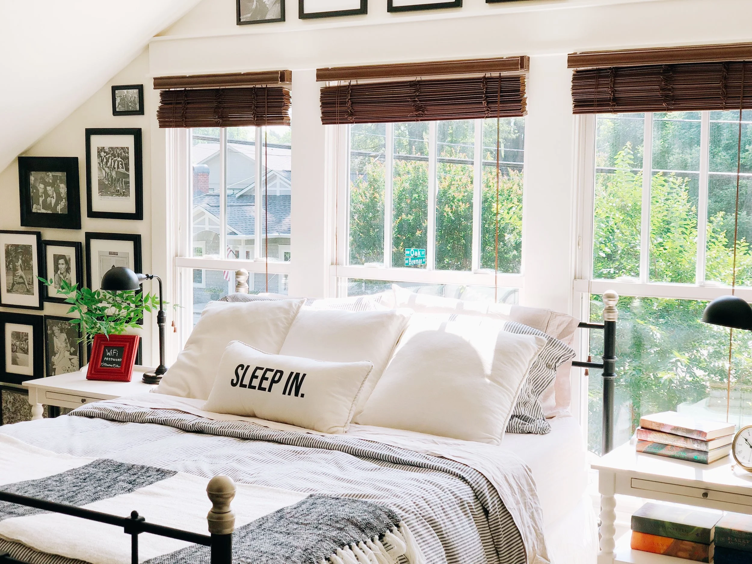
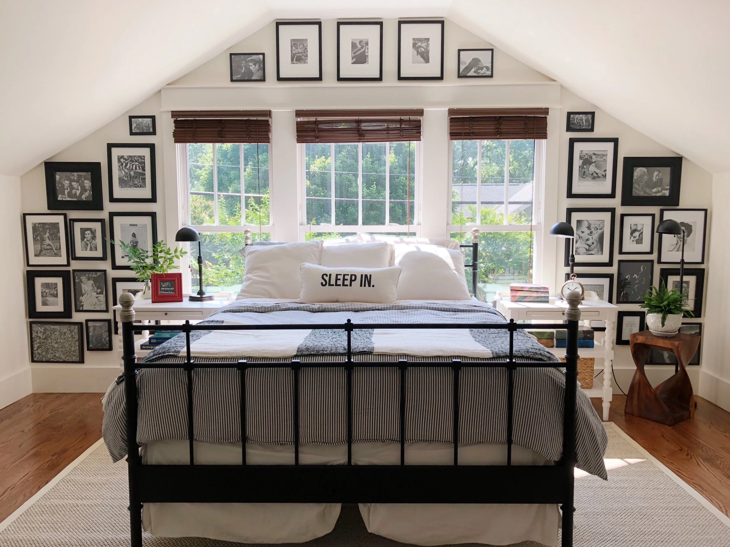
In the meantime, here’s how it all looks after we put it all together:
We wanted to go for a bright, classic look, so we used whites, blacks, warm wood tones, and blue got a fresh and somewhat coastal theme. This room gets the most beautiful light in the morning and we wanted the room to reflect that happy, positive feeling of waking up.
Again, you can check out the whole process in our newest YouTube video below!
Source list:


