We Gave Our Daughter’s Room a Refresh with New Paint and Art
/Sometimes a little goes a long way! Here’s how it all went down…
Last week, we helped Benjamin Moore unveil their Color of the Year for 2022 (October Mist 1495) and so we had to find a way to use the color, and potentially some other colors in their Color Trends palette, in our house somewhere. All of the colors they chose this year are beautiful, like a big gulp of fresh air, so finding the right project wasn’t going to be hard.
When he saw Venetian Portico AF-185, a dusty, mauve-ish pink, on the list, PJ was sold. Anna’s favorite color is pink, and PJ has been wanting to paint her room pink for so long, so this seemed like the perfect opportunity to do just that. I like that's Venetian Portico isn’t so obviously pink, but more of a neutral, fun take on the classic color.
PJ decided to paint an old hutch that was living in our bathroom October Mist to brighten it up and add some more storage to her room. It fits perfectly on the wall directly across from her bed next to her closet, like it was made for that spot. How fun are all of the items against that greenish-grey color? We also both love the combination of the pink and the green together. It’s quirky and exactly the look PJ was going for.
He took creative control on this project and it was so fun to watch him put the room together piece by piece. I handled all the painting, which I weirdly find therapeutic, and he handled the rest. He borrowed the blinds from the upstairs kids’ bathroom for her room and they looked so good in there (they match the hutch perfectly!) that they’re staying in her room full time now.
One of my favorite parts of her room is this little desk that PJ set up for her. It’s an old nightstand we’ve had for almost 10 years that has always felt too small to know what to do with (we actually used it as her bedside table before redoing her room). He set it up by the green chair and put some art supplies on it. It has a small tray that you can pull out and it’s the perfect size for her to color and draw on. She loves having her own space to create now!
The small wooden chair for her new desk (that we painted the bottom half of October Mist) was one of the chairs I sat on when I was little and lived in this house- it was in our kitchen and it was one of the chairs that my brother and sister and I sat on while we ate).
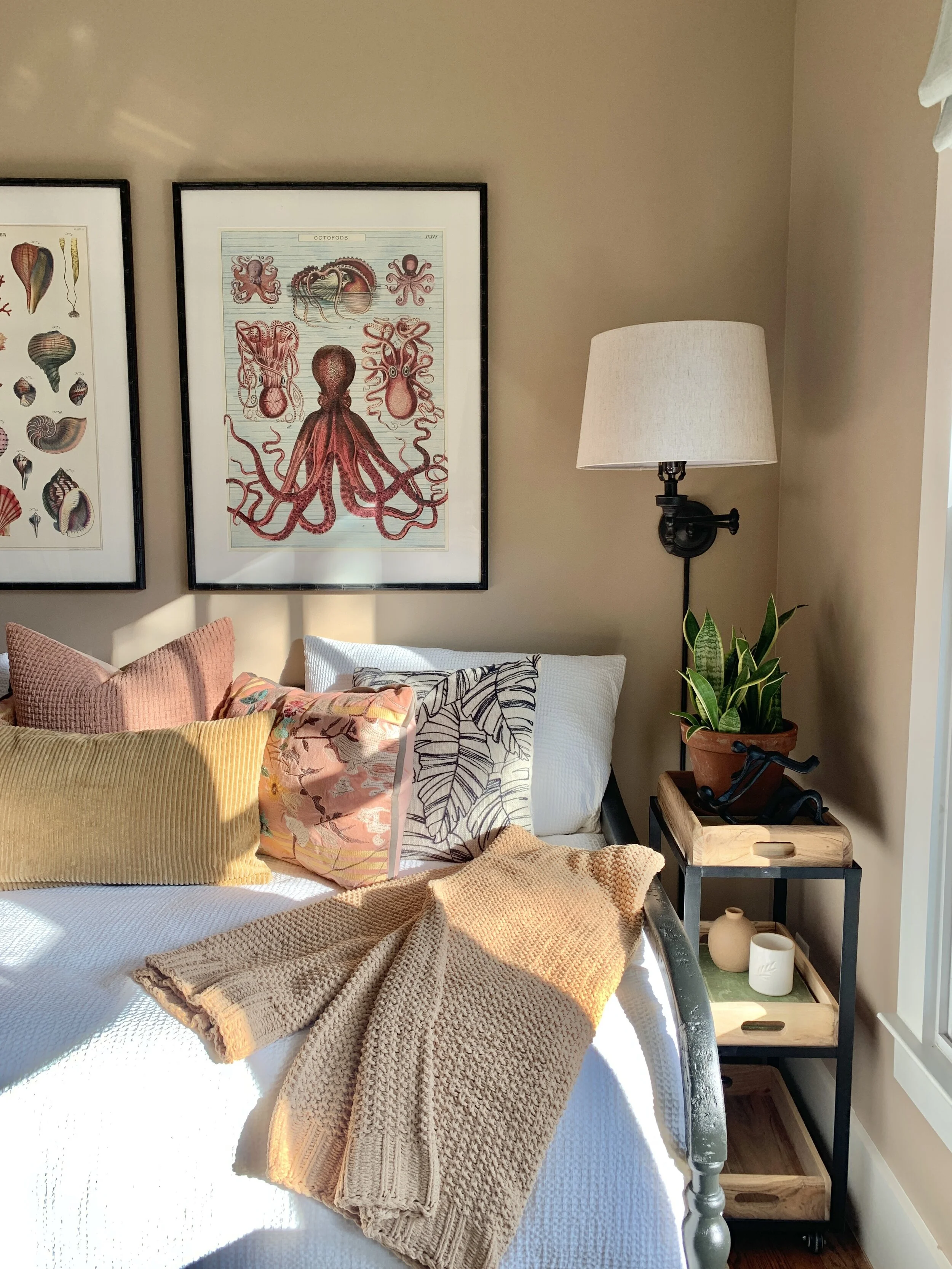
Even though we loved the colorful frame wall that was above her bed before, we wanted something a little less fussy, less busy, and a little more symmetrical. The two prints now balance out the two matching sconce lamps and bedside tables on either side of her bed, and I think it all looks a little more put together than before. Again, we loved her frame wall (especially since we made most of the art ourselves!), we just love this look, too. There’s always room for more than one style appreciation!!
For reference, here are a few side by side photos to show the full before and afters:
We took most of these pictures in the evening, between 5-6p because that’s always our favorite time of the day in her room. The entire space lights up with the evening sun and the room absolutely glows. It feels like you’re directly in the center of some kind of warm horizon. It’s hard to explain, but it’s beautiful to witness.
So now her room is complete and we all love it. We only sort-of decorated our kids’ rooms over the last few years. We wanted to wait until things were 100% official before fully committing to decorating and styling their rooms, and now that we’re a forever family, it’ll be fun to finally dive in and make each room reflect their individual personalities.
It felt so good to type every word of that paragraph above. Every. Single. Word.
Sources:
Daybed | Sconces (similar) | Lamp shades | Rug | Mirror | Comforter | Side tables (similar) and also here | Leather chair (similar) | Wicker baskets | Wooden stool (similar)


