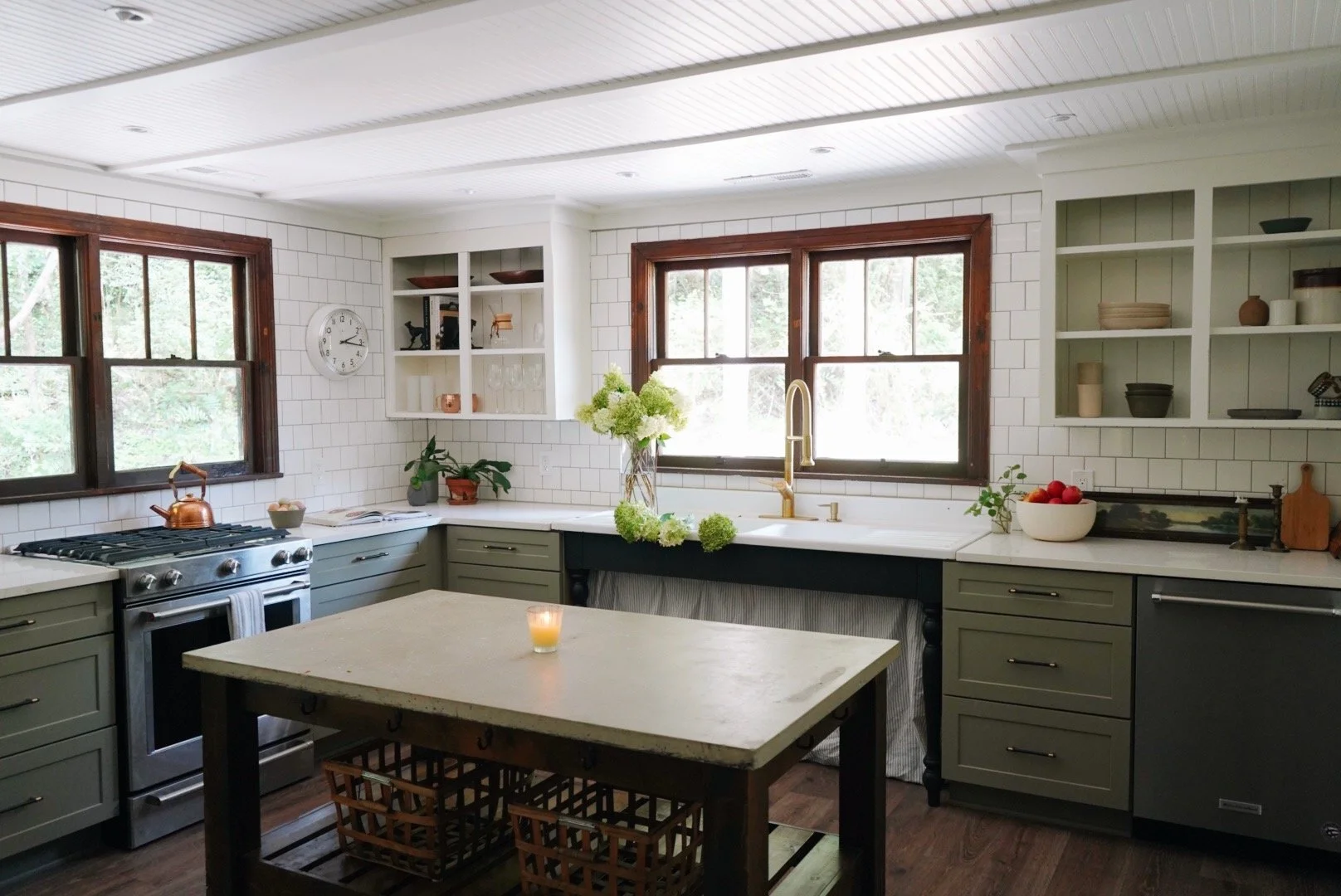
The Kitchen at Getaway House is Finished!!!
/Here it is!!
I am so excited to be writing this: Getaway House’s kitchen is finally finished! This little cottage has been a labor of love over the last year and we both agreed that this kitchen is probably our favorite one we’ve ever done. The first time we walked in we immediately knew what the layout was supposed to be.
The previous layout made no sense to us, especially the washer and dryer being in the kitchen. I will say, it is a small house, so there wasn’t really a place for them to go before we renovated it, but they weren’t centered under the two windows so it just looked awkward and even more out of place.
Before
After
The best part about this whole renovation is that almost all of materials used were second-hand, bought at discount, or things we already had.
Take the cabinets for example: PJ found them on Facebook Marketplace for an absolute steal. He got something like 25 cabinets for a little over $2k about two years ago and they’ve just been sitting in our storage building waiting to be used. We used about half of them in here and made them fit like a glove by designing a new, L shaped layout.
We relocated the washer and dryer and made them a stackable at the end of the hallway which opened up room under the two windows directly across from the entrance to the kitchen. We knew that was the perfect place to put a stove, and suddenly the flow and layout just presented itself and we didn’t stray much from our original plan.
The upper cabinets are original, just painted the same color as the walls (White Dove by Benjamin Moore) and with the doors removed. We thought about taking them down all together and just doing new open shelving, but something about the way they looked with the doors off and painted felt both traditional and fresh at the same time. They still feel open and airy but have a little nod to what was original to the house.
PJ had the crew add paneling to the back of the cabinets for a little something extra.
Other than that, we kept the window trim the original stained color and opted not to replace the windows in the kitchen, or any in the entire house, because they’re in such good condition. We both love the way the dark wood on the windows pops against the 4x4 tile on the wall, and how it contrasts with the green cabinets. It just all feels very earthy, calming, and comfortable.
Before
After
The countertops are quartzite. We wanted a honed counter, but loved the goldish-brown veining of this slab and thought it would tie in to the wood tones in the kitchen that we decided on this shinier one instead. The contrast of the white counters with the green cabinets is my favorite. It all feels very light and casual, like a kitchen you could actually cook in and not tiptoe around.
The 4x4 subway tile came from an old palette from Home Depot about seven years ago. They were selling all of these palettes for $10 a piece of items they couldn’t sell on the floor, and whatever was on the palette was what you got (they were wrapped up so you couldn’t really see what you were getting). PJ bought a few of the palettes and in one of them was all of this tile that we have used in almost every house we’ve renovated lately. It’s lasted for years, but this might be the last house we’ll be able to use it on. We’re almost out of them!
PJ had the idea of bringing the tile from the floor all the way to the ceiling, something we wanted to do to our kitchen in town when we renovated it five years ago, but we just never got around to it. So, good thing for this house so that we can live our entire wall-of-tile-dreams. I love how all the tile feels so industrial and clean.
We brought in art from our house in town that we thought would fit the space well. The art above the lamp used to live in our kitchen at home on the chalkboard wall, and I love how the light wood frame popped against the black paint, but I love how it looks even more in here against the tile.
It’s like it was meant to be here the entire time.
The green oar on the right wall used to be in the farmhouse PJ grew up in.
The island was another FB Marketplace find over a year ago, originally meant for Holiday House before that renovation became so extensive. It was a display table at Anthropologie but we thought it made the perfect island. Every time people see it they immediately compliment it, and I can see why. It’s extremely durable and can easily take a beating, so we’re not worried about people who stay here potentially ruining it.
So there you have it! We technically need to style all three bedrooms, but other than that, Getaway House is finished and ready for its first guests. We can’t wait to welcome whoever books it, and hope they find it as magical and peaceful as we do.


