Moving Furniture Around for a New Look in the Front Room

Do you ever move furniture around your house just for fun?

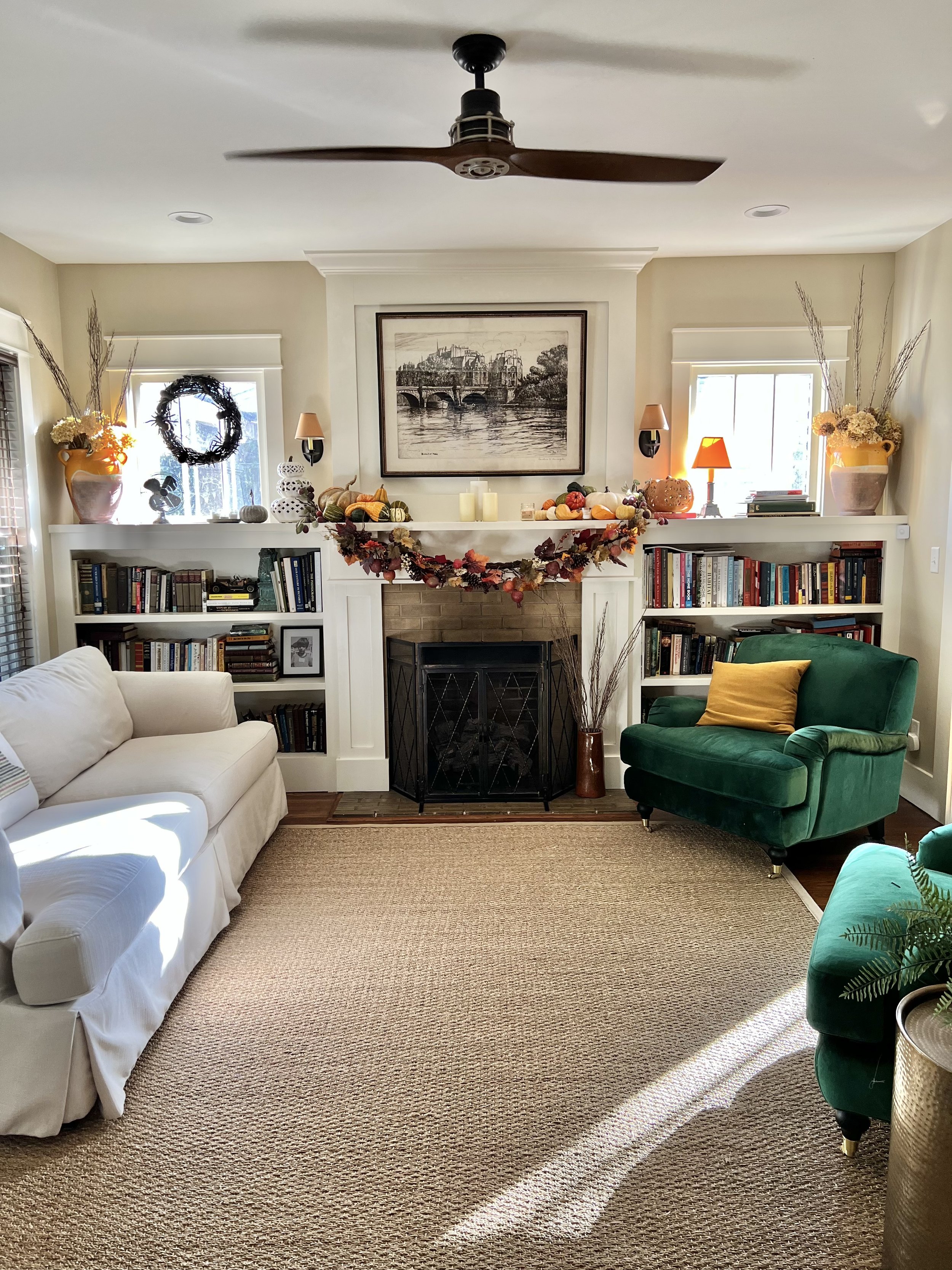
After five years of the same front room setup, I decided it was time for a change. So the other day while PJ was at the farm, I moved the rug, the couch and two chairs for a completely new look. It feels so much bigger now!

This is what it looked like before:

The new arrangement is actually the same setup as our front room when I was growing up here. My family had the couch under the three windows and a chair by the bookcase. It feels like a special little nod to my childhood having it set up this way, and I really like it.

PJ likes it, too, thankfully. I first told him we could live with this new setup for a few days, as I was on the fence about it, but I’ve grown to really like the new layout. We had Matt and Beau over last night and the new setup made sense in a conversational setting, which is the real test on if a seating arrangement works or not.

Growing up, I was always rearranging rooms in my house, much to my family’s dismay and annoyance, but I didn’t mind. It brings me joy, and life is too short not to do things that bring you joy, right?

I honestly didn’t mind the previous layout, I just wanted a change for the new season. It feels good to switch things up every now and then!

4 Comments

The Perfect Black Paint Color AKA The Exterior Reveal of Getaway House

The Perfect Black Paint Color AKA The Exterior Reveal of Getaway House

Getaway House is finally finished after around nine months of working on it from start to finish! But the color we chose for the exterior has been even longer in the making.

Read More
12 Comments

These Tulips Are Fake, But You Would Never Know It

A few months back, Nancy Meyers posted a photo of her den with a vase filled with beautiful tulips and it completely stopped me in my tracks. How stunning is this entire room?

source: nancy meyers’s ig

I’m sure they are real and expensive and they look so perfect just sitting there in her drool-worthy den. Color me inspired! I had been wanting something for the dresser in our bedroom, just a little something to make it look finished. We have a lamp and some books, but it needed some greenery, as every room does. The only problem is our room is so dark and never gets direct sunlight, so real plants aren’t really an option in there.

After a quick search on Amazon, I found these fake tulips for under $20 and I am in love. Don’t they look so real? I through them in a vase we already had while PJ put a little water in it and separated and bent the tulips to make them look even more real (a trick he taught me!).

So there you have it! The cheapest, best looking fake tulips out there.

9 Comments

A Big Update on Holiday House

A Big Update on Holiday House

Holiday House has come such a long way from where it was when we bought it almost two years ago, and it still has such a ways to go, but there is finally a lot of progress happening all at once!

Read More
7 Comments

Nancy Meyers’s Home in Architectural Digest

Design lovers! We have been fed!

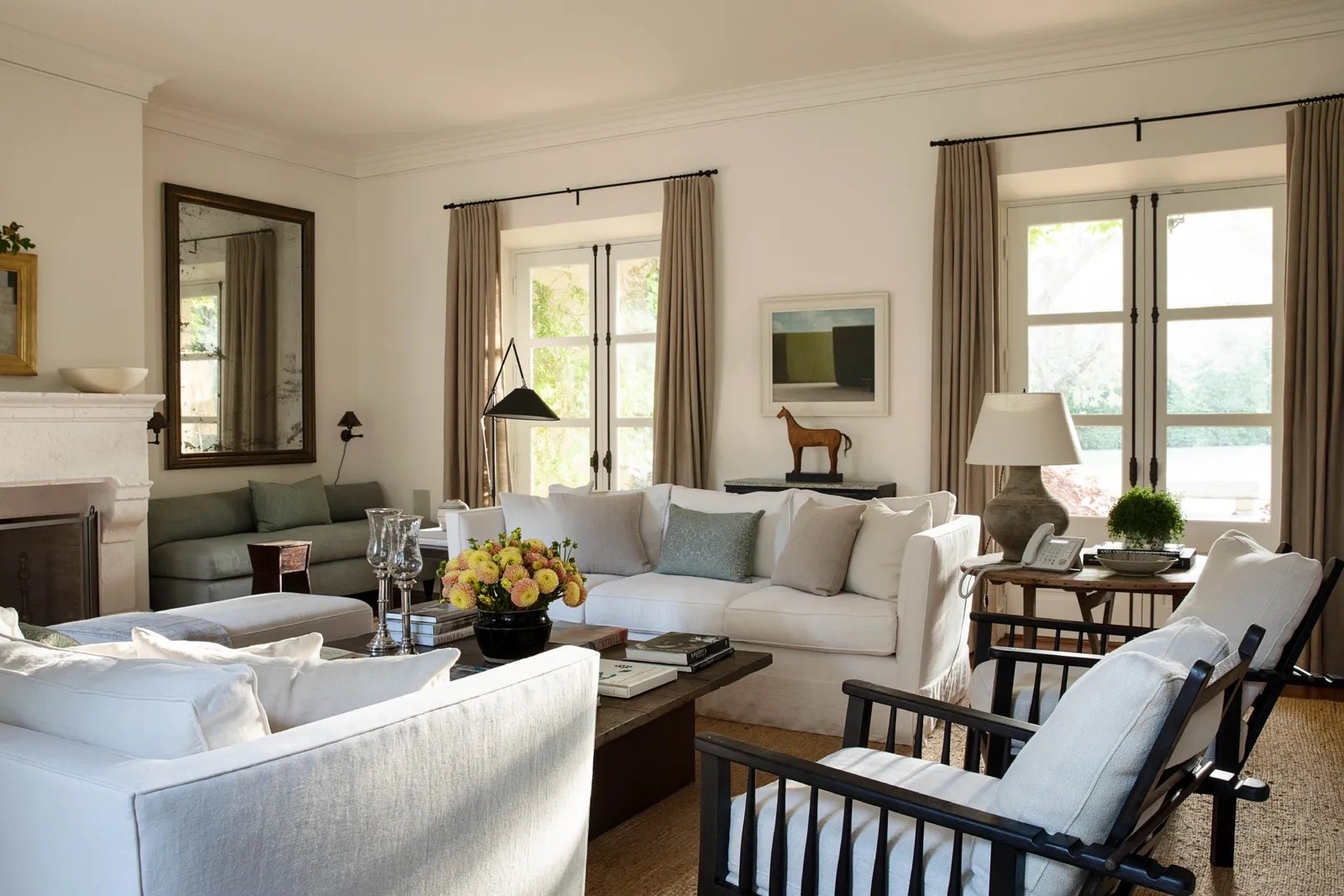
After years of swooning over her movie houses, like Something’s Gotta Give, The Holiday, and The Intern, I have always wondered what the inside of iconic filmmaker Nancy Meyers’s home actually looks like (we only get glimpses from her Instagram and an old feature in a magazine over a decade ago), Architectural Digest has just published a tour of her beautiful, casual L.A. home and it does not disappoint.

It’s giving It’s Complicated more than any of her other movies, and I love her use of white and various shades of beige and cream, which has become her signature style in so many of her films. Everything looks so put together, like it has a place and a purpose. It’s all so dreamy and is getting me excited for when Holiday House is finished. I want it to look and feel just like Nancy’s house.

Then again, don’t we all wish our home looked like one of Nancy’s? You can click here to tour her whole house and see the rest of the photos.

(All photos by Amy Neunsinger via Architectural Digest)

5 Comments

A Tour of the New Beach House

It’s small and needs a lot of work, but we absolutely love it (maybe even more than the first one?).

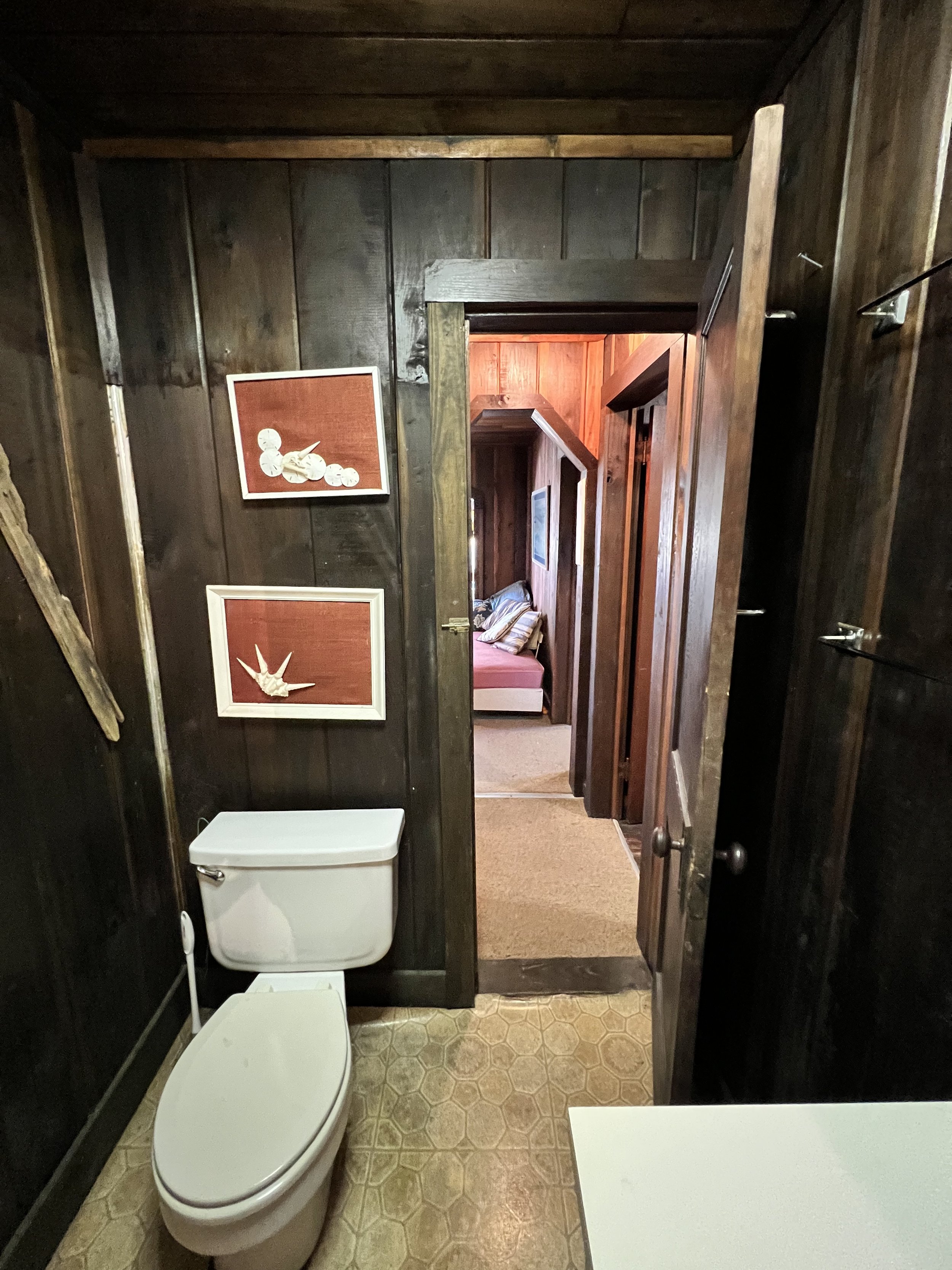
The new(er) beach house has a decidedly California-cool, breezy vibe to it. The wood plank walls that cover the entire inside are in great condition and give the house a vintage vibe, elevating an otherwise dated interior. With all the wood on the walls, it’s extremely dark in the house, and not helping, of course, is the fact that all the windows were covered with curtains and blinds when we toured it.

Once those are gone, I feel like the house will be bursting with light!

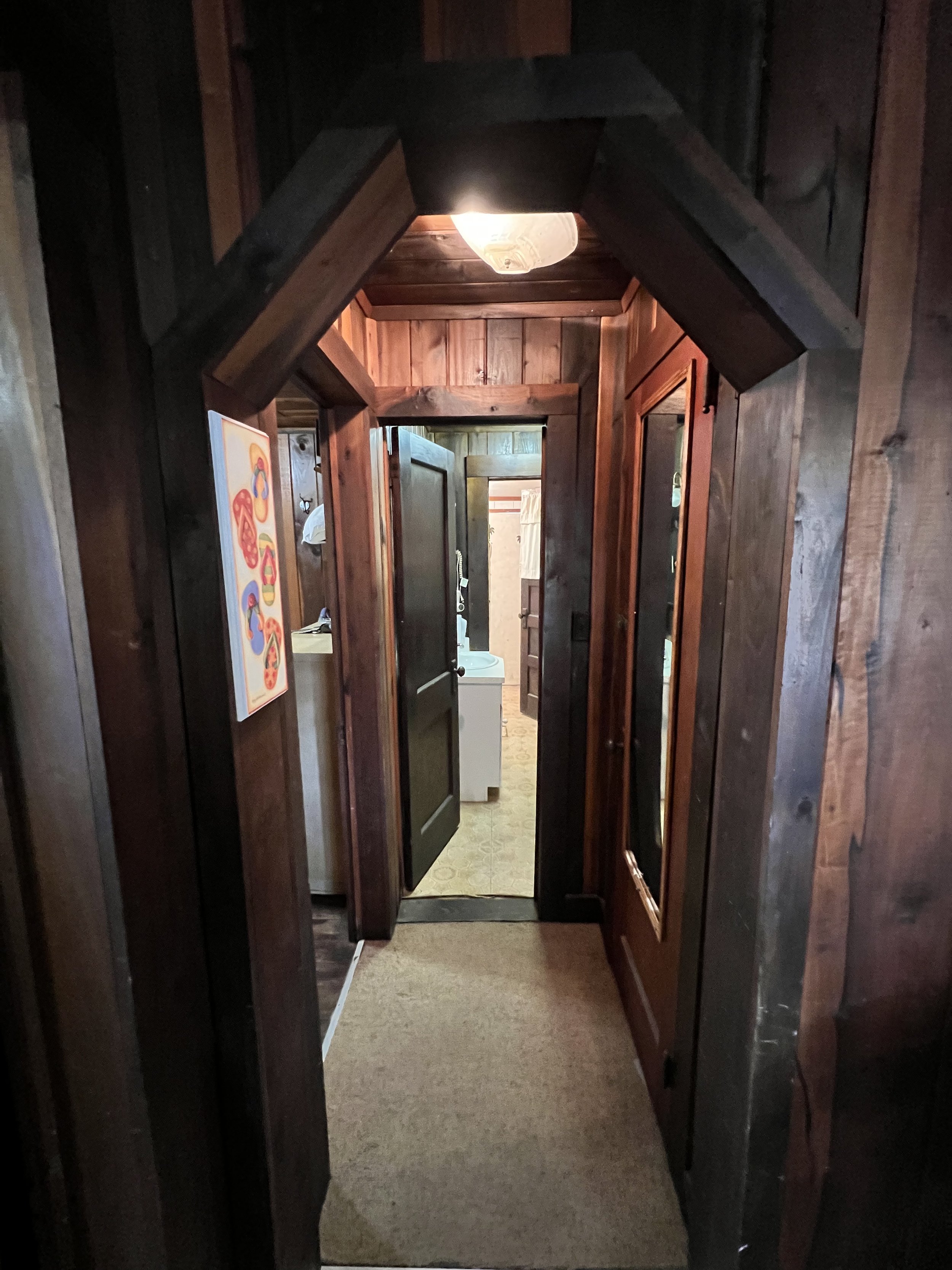
How cute is the little arched doorway leading into the hall?

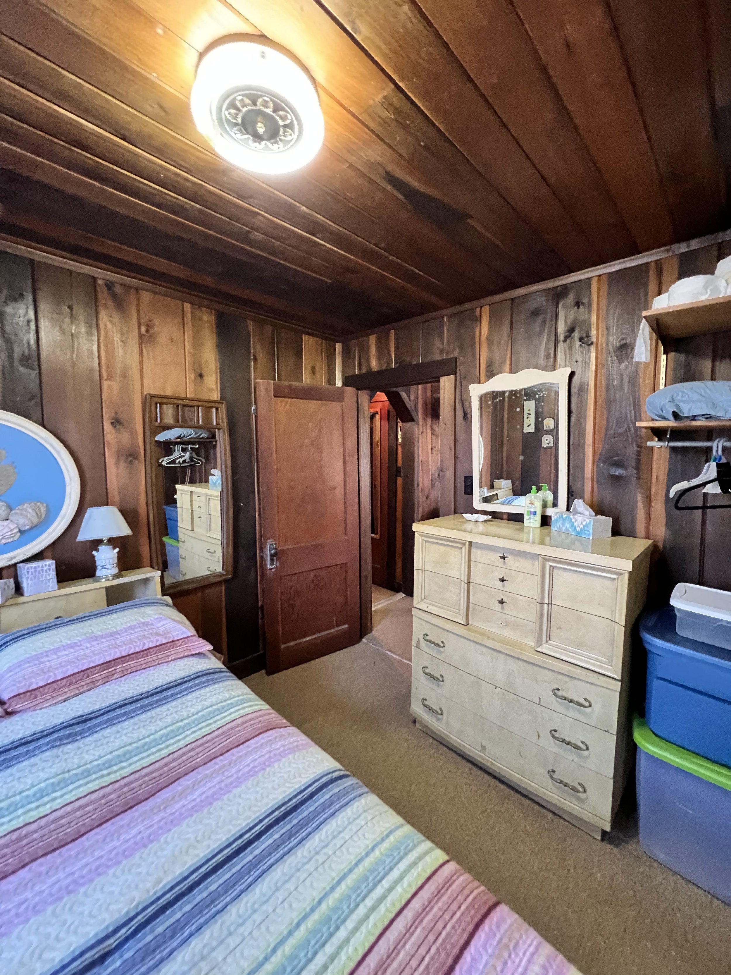
The bedrooms are itty-bitty, but they’re cozy. And I love how the wood panels on the walls are carried to the ceilings as well. Soooo charming!!!

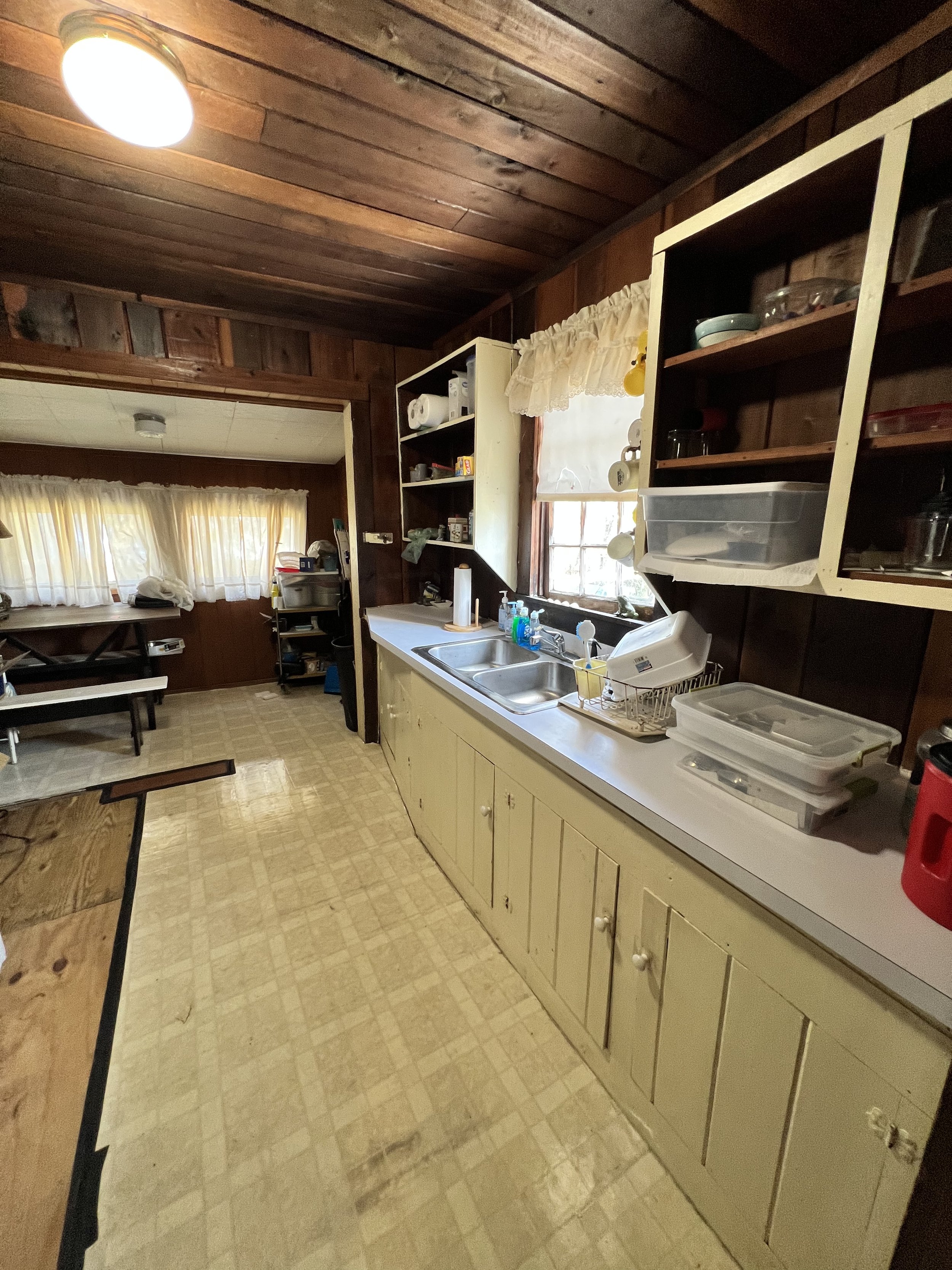
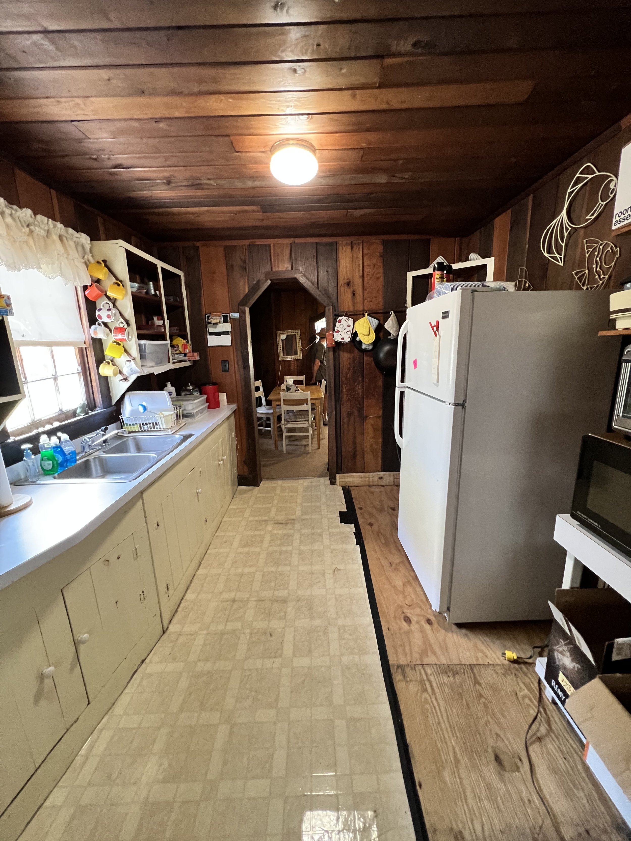
The kitchen is actually a really cute size. I weirdly love the old (probably original) cabinets, too. They’re charming, too, aren’t they? We’ll most likely replace everything in here and make it more functional for our family (and others who choose to stay here!), but it’s fun to appreciate the kitchen as it is in its current state for a while.

The house currently doesn’t have a stove, so that’s something we’ll be addressing sooner rather than later. I’m already envisioning more of a small galley kitchen, with the stove and fridge wall directly across from the sink wall.

So there you have it! Not much to it, is there? We are keeping all of the wood as is and will be brightening the house up with lighter curtains and furniture/art. We really want to lean into the breezy, beachy vibe this house already has (without getting theme-y), and just want to make a few changes so that it brings it up to the 21st century a little bit.

We can’t wait to get started and to officially call it ours!!

PS: click here to watch the tour in video form

14 Comments

A Gorgeous Greek Revival House in Hudson

When I came across this stunning 1815 Greek Revival home on Curbed, it stopped me in my tracks. The wide-plank floors! The humungous windows! The bathrooms! All those damn fireplaces!!

Read More
2 Comments

The Trailer Inside Holiday House is Officially Gone

We’ve been waiting for this day for what feels like forever.

The small cottage on our farm that we call Holiday House was originally a single wide trailer put there in the 50’s or 60’s. Then, some time later, they built an entire house around it and added on, effectively enclosing the trailer inside the frame of an actual house. When we bought it, we always knew we wanted to demolish the trailer side to raise the ceilings and windows and now, finally, that day has come!

PJ hired a crew to demo the trailer side and cut it out of the house and they’re finishing up today! I say cut it out because they literally had to cut the metal 1950’s trailer out to get rid of it. It’s actually quite fascinating. I’ve never seen anything like it before. It’s not cleaned just yet and there’s insulation everywhere, but now that the walls are down and it’s one big open space (on what was once the old trailer side), it’ll be easier for us to draw up floor plans and envision what we want for the space.

Right now, we know we have to fit part of the kitchen, a bathroom/laundry room, the boys’ room, and our primary bathroom in the space of the demoed side. Holiday House isn’t big by any means, so we’re going to have to get creative in how we lay it out. Luckily, PJ loves to come up with floor plans and stretch his creativity to the max in the process.

This is going to be so fun!! It’s just the start, but things are happening fast and PJ is making it all come together at what feels like lightning speed, after almost a year of no progress on Holiday House. We’re hoping to be finished, or close to it, by the beginning of summer.

Here we go!!

10 Comments

Renovations Are Starting Back Up Again at Holiday House!

After almost a year with little to no updates, renovations have begun once again on holiday house, meaning we’re thatmuchcloser to it becoming what it was always meant to be for our family: a relaxing escape.

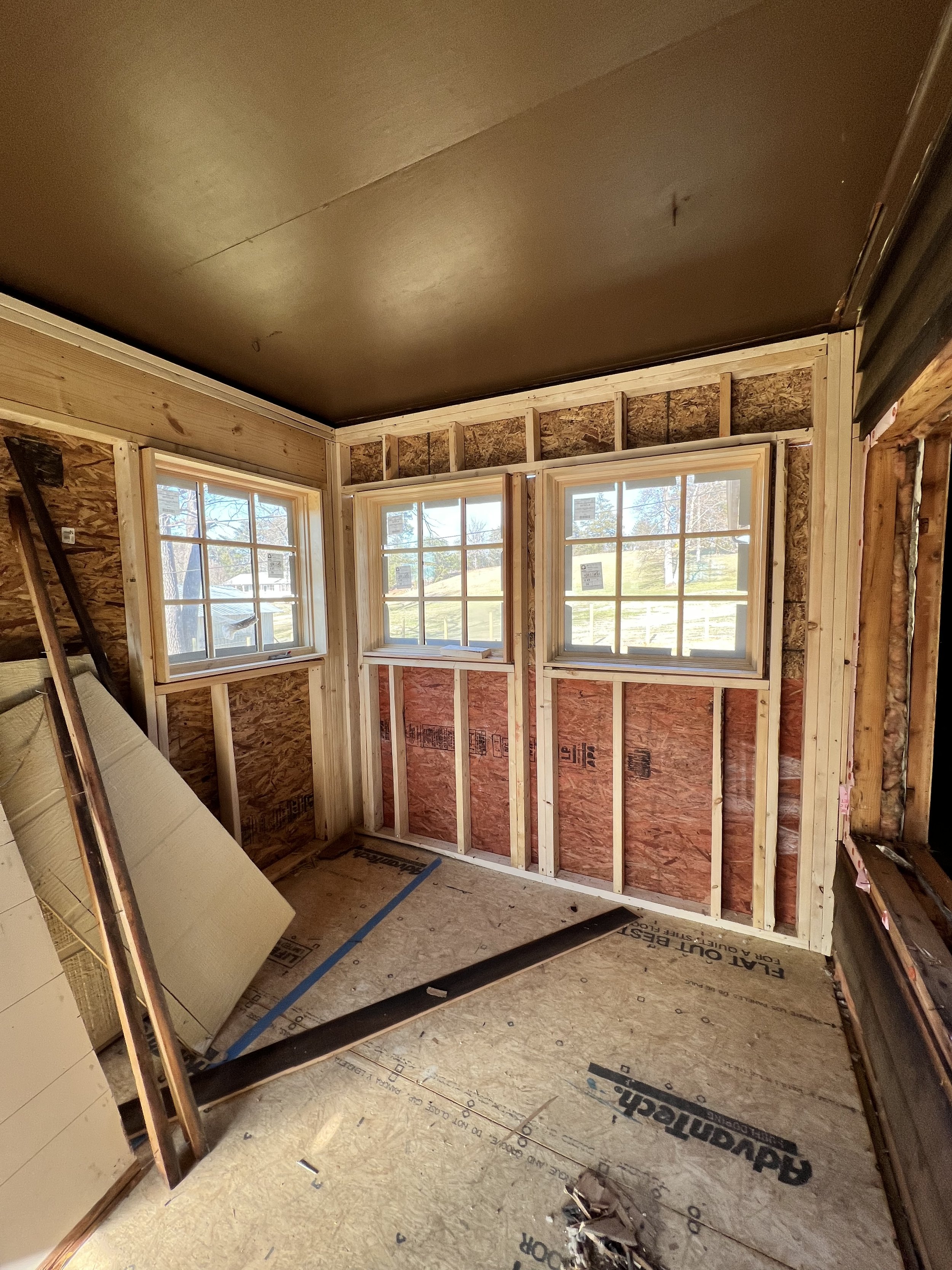
It’s hard to believe it’s been just under a year since we have made any progress on Holiday House, the small cottage on our farm that we purchased at the end of 2020 as a little getaway for our family. It’s a long story, but in short, it was a single-wide trailer that they added on to decades ago, and then built an entire frame around and on top of the trailer to turn it into an actual house. Sound confusing? That’s because it is, but all you need to know now is that as of the last week, PJ has been tearing down walls and hiring a crew to come in and frame the old side porch into the space that will eventually be our new ktichen.

Isn’t that so exciting?! And how beautiful are those windows? PJ found them for a great price on Facebook Marketplace (where else?) and they look even better than I thought they would. The new kitchen will overlook the side yard and the driveway, getting plenty of afternoon and evening light. It’ll also be huge. Like, a lot bigger than the current one and actually bigger than our townhouse kitchen. They say the kitchen is the heart of the home, the family hub, and that’s exactly what we want this one to be.

The plan for now is to have a range in the middle of the windows with counters on each side, and directly across from it will be a massive island with a sink in it. It’s sort of hard to get an idea of the layout and design from these photos, but the way PJ has designed this space is gorgeous and I know we both can’t wait to see it come to life.

He spent the majority of yesterday taking down the wall separating the old dining room, which is in the trailer side of Holiday House, and the new kitchen addition. See where those two empty spots are where it looks like windows used to be? That wall is coming down to create a bigger kitchen, so those two rooms will flow together. That doorway to the left of the windows is also going away so that, again, the whole space is open and bigger.

We’ll share full design plans and the new layout soon, but for now it just feels so good to see progress being made out there again. We have fallen even more in love with the farm within the last year, craving it more than ever, and we can really see a future for our family out there. What does that look like? We’ll be sharing that soon as well.

And in the meantime, yay for progress!!!

Comment

A Look At Our Fall Mantel This Year

A Look At Our Fall Mantel This Year

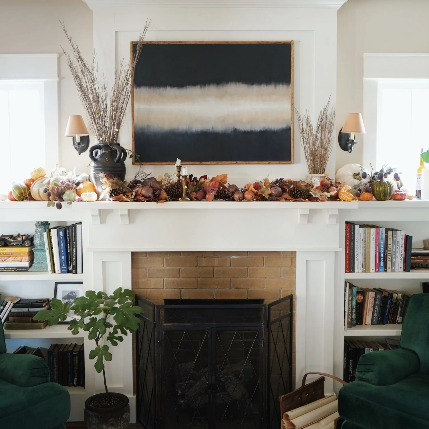
This might be my favorite fall mantel we’ve ever done, so let’s take a look, because all of this is coming down tomorrow to make room for Christmas decorations!

Read More
10 Comments

The Living Room Floor at Holiday House is In!!

The Living Room Floor at Holiday House is In!!

Is it not always the best feeling ever to cross something off a to-do list? Especially when that list is over a year in the making?

Read More
4 Comments

Graydon Carter's NYC Apartment

Graydon-Carters-Apartment-Living-Room.jpg

Today was spent in our room organizing tax paperwork while continuing to watch the 9/11 documentary. Riveting stuff. So why don’t we look at something a little more beautiful and inspiring?

I’ve been obsessed with former Vanity Fair (and current Airmail News) Editor in Chief Graydon Carter’s old New York City apartment for years. It has a maximalist quality to it that you don’t see much of in today’s design world. Speaking for both me and PJ, who are definitely maximalists in our own right, I love seeing a cozy, controlled-chaos sort of style that feels relaxed and unpretentious. One where artifacts and collectibles and books and things take center stage and create an atmosphere you just want to get lost in.

The interiors were shot way back in 1996 but still feel surprisingly current. It goes to show you that good, classic design never goes out of style (that kitchen! those leather chairs! that map collection in the office!). Click here for the full tour.

(photo via Scene Therapy)

7 Comments

Is It Ever Too Early To Start Decorating For Fall?

I mean truly, is it ever?

It’s a question I ask myself every year around this time as we inch closer and closer to September. When is too early to start decorating for our favorite season? Or, do you even decorate at all? It could be something as subtle as an orange vase or some branches in a room, or a wreath on the front door, or maybe an extra throw blanket on the couch. Or even my personal favorite: a new fall candle.

I brought an orange vase into the living room from Holiday House the other day with some branches PJ found years ago on the side of the road and it was just the small touch of fall I think I needed to get me excited for it this year. Even though autumn is reportedly going to feel different this year, we still get excited about it all the same and I don’t think that’s ever going to change. After all, we did get married in October (6 years ago!).

A few photos from last year’s fall:

So we haven’t gone full-out in decorating for fall yet; we don’t usually do that until September. It’s 93 degrees today with no signs of getting cooler any time soon, so the A/C will be turned down to 70 for the next couple of months until it feels good enough to open the doors and windows and let the cool, fresh air in.

Happy Friday Eve, friends!

10 Comments